
Being a typographer, I am often frustrated at myself for letting my typographic neuroses get the better of me. Movie credits, menus, and signage of all sorts provide fodder for rants and raves about how bad use of letterforms is ruining the world.
Equally frustrating to me is how bad typography is accepted so easily by the world at large. It’s a small circle that seems to share my aesthetic horror at the typographic nightmares around us.
I realize that my neuroses are relatively unimportant in the greater scheme of things, and I generally keep it to myself when confronted with an instance of, say, bad kerning. But it strikes me that there is a place for concern about the finer points of typography in the building of one’s image. And even though the world might not realize the pains you’ve taken, I think that careful use of typography pays off, even if subconsciously.
And so I present for your digestion the mighty ligature.
A ligature is basically two letterforms joined together to create a single form. The classic example of a ligature is the “f i” ligature.

The dot of the “i” intrudes into the space of the “f”‘s overhanging arch, and so typographers created the “fi” ligature which generally dispenses with the dot and brings the crossbar of the “f” across to the top of the “i”.
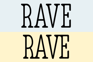
Modern typography has taken the ligature to extremes. For instance, the font shown below features hundreds of ligatures, including, in this example, the joining of the bottoms of the “R” and “A”, and of the tops of the “V” and “E”.

Look for a minute at the comparison between the non-ligatured text sample, and the sample that has ligatures included.

Which sample would you rather look at? Which sample says to the world that you have taken pains to make things as beautiful as possible? It may be a subtle difference, but an important one. Using the ligatures provided in a font adds a professionalism to your designs that makes an impact, even if it’s not glaringly obvious.
Related articles by Zemanta
- 50 Helpful Typography Tools And Resources (smashingmagazine.com)
- MIX10: The Art, Science & Technology of Reading (lukew.com)
- MoMA adds “@” to its collection (wisdump.com)