The world is full of bad, ugly and boring logos. Everywhere you look, someone has, in their mind, saved a boatload of cash by cobbling together some art done by their cousin or preschooler and the first typeface that struck their eye as they scrolled down the font list in Publisher. Which is usually comic sans. I understand. Not everyone needs to hire a professional designer. Not everyone can afford a comprehensive identity development. Sometimes it makes sense to put your money elsewhere, especially if your customers will never be affected by it. But if you are an industry leader with a well-recognized brand that you want to make stronger, the way to continue to lead in the marketplace is to evolve and educate, not underestimate your audience, dumb down your image and play it safe.
Simple is not Necessarily Boring
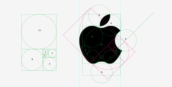
I'm not saying logos can't be simple. Some of the most effective and beautiful logos are the simplest. The simplicity does not mean they are not well thought out—in fact, the process can, and should, involve hundreds of ideas which get distilled and refined into a single, simple, stunning image that tells the story of your brand with clarity and emotion, and hopefully makes the world a more beautiful place. Often there is an underlying sacred geometry which we may not be able to explain, but to which we intuitively respond.

However, there is a difference between simple and boring. A boring new logo affects the consumer's experience with the brand. Consumers are not stupid. They recognize good and exciting design as well as bad and boring. Anything less than spectacular may leave a customer feeling betrayed. And with social media making voluminous customer sentiment public and instantaneous, there are no longer just a few lonely voices screaming “the Emperor has no clothes”…there are thousands. Last year the Gap rolled out their new identity. And it wasn't just Helvetica-hating designers who felt Gap's new logo flopped. To their credit, the company tried to explain themselves, and opened up a dialog with their customers, including an opportunity to ”share their designs” on Facebook. Ultimately, the new design was pulled.
Design is Subjective, to a Point
You can argue that design is subjective—that one person’s visual nightmare is another's eye candy. You can also make the point that designers see things differently, and are the only ones that notice or care about subtleties in logo design, like typeface choice, line, shape, color and form. This is true, some of the time. However, more often than not, design is an integral part of selling products or ideas because it is a universal language of beauty. The human eye, whether trained in design or not, recognizes good design. There is a reason that Frank Lloyd Wright's Falling Water is regarded as the world's most beautiful house; why any Lamborghini sells for a bit more than an AMC Pacer; and why Apple's product design, graphic design and interface design has made it the world's most successful brand. Access to so much visual information, all the time, and being constantly bombarded with increasingly more sophisticated marketing materials has made consumers very visually sophisticated, savvy and discerning. The more we are flooded with images, good, mediocre and terrible, the more we understand and recognize the elements of design and what they communicate about a brand. A logo with a typeface anyone can find on their pc can say, without words, that a company's product or service is low quality or unimaginative. Stereotyped illustrations that are, or border on, ”clip art” talk down to consumers and leave a bad impression about a company. And rebranding a multi-billion dollar fashion retailer using Helvetica and a blue square tells me they don't appreciate or understand their customers' level of sophistication, intelligence or awareness.
The Beast and the Beauty
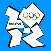
Sometimes a logo can be effective, and innovative, but just not my cup of tea. I am talking about the London Olympics 2012. I hate it. And so do a lot of other people. But I have come to understand it, primarily because of its application in the venues and how it has been animated online and in broadcast. When designing a logo these days, one needs to be aware of how it appears in all media, all applications and how it lives, breathes, moves and changes. I appreciate what I think the logo's designers were trying to accomplish, which include the almost-hidden "2012"; unexpected, shocking, sharp angles; and a blocky, clumsy human form to represent an event of curves, beauty and fluidity in motion. Still, I don't like it. I would point out, for contrast, the stunning identity for 2010 Vancouver Olympics, which my family and I experienced in person. From the Vancouver Airport to the venues at Whistler, we were surrounded by beautiful imagery of an impressive, fresh and modern campaign with illustrations, line, form textures and colors that were clearly in the same family, yet different in every single impression. The depth and sophistication are overwhelming, seductive, comforting, exciting and above all, very human and emotionally evocative.
Bored to tears

I am, by Microsoft's new look. But, trying to stay awake as I look at this vanilla flavored, beige minivan of bland branding, I still must acknowledge that the application and thinking is solid, though the look of the standalone mark reeks of corporate committee, risk-averse thinking. Unlike some designers, however, I actually like the new ebay logo, but I am left wondering if the same committee had a hand in the design, given the suspicious similarities in the color palette. And then there's the ultimate dumbed-down corporate identity redesign, USA Today's new logo. My inspiration to write this was Steven Colbert’s hilarious bit a few weeks ago. But as Erik Wemple at the Washington Post points out, the criticisms are “cheap and easy…give it time” I am inclined to agree. Is it just plain stupid, or innovative and alive, dynamic and flexible? Time will tell.

USA Today logo, old and new.
There is Hope
Although designers can be sarcastic and judgmental, we are also optimistic, hopeful, and driven by the need to make something new. In the design process, we absorb and synthesize. The more we absorb—the more thorough our research—the better the end result. When I see an awesome new identity, I am inspired. I feel like that company or entity respects my intelligence. Intuitively, I understand the breadth of their research, and how they have absorbed hundreds or thousands of disparate influences and distilled them into an image that makes me feel something. I am curious about their spirit of innovation, and what it means about their new product line, their innovative ideas, their services, their story. The world is new again, vibrant, colorful and full of creativity, beauty and success. I leave you with another example of how it's done right:
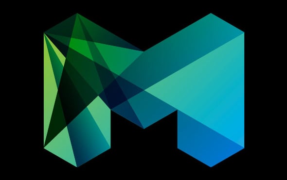
2009 Logo for City of Melbourne, Australia
Apple logo image courtesy of http://www.banskt.com/blog/golden-ratio-in-logo-designs/


