Let's continue to dig into logo design. Logos fall into 3 basic categories: Standalone Symbol, logotype/wordmark, and combination marks. In this post we will explore the wordmark. (In the first in this series of blog posts, Logo, Corporate Identity or Brand—What’s the Difference? I briefly explored these three marketing essentials and their relationship to each other. From there, we dig into each of these, starting with logo design.)
What is a Wordmark?
Logos that use only type are generally referred to as wordmarks. Here are a few examples:
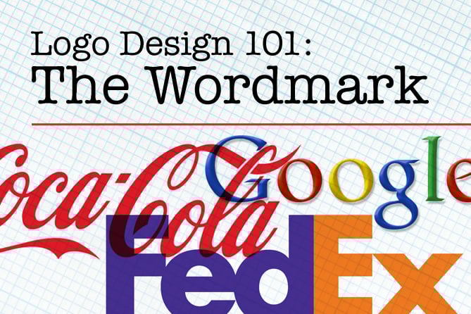
 Figure 1. Wordmarks of various industries, including technology, internet, automotive and news media.
It's About Type
Whether comprised of initials (IBM=International Business Machines; RCA=Radio Corporation of America) single words or multiple words, wordmarks generally stand on their own with no accompanying symbol. Their distinct character is due in part to the typeface chosen. Typefaces, or fonts, have unique characteristics that can be used to communicate a look and feel, make a desired impression on a desired demographic. The variations are virtually limitless. In this example, consider the options possible using only one typeface, Univers:
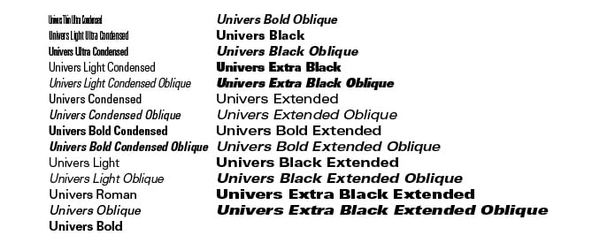 Figure 2. The many faces of just one font, Univers.
Univers is a classic, time-honored san serif typeface family with many children. Depending on how it is used, it can impart a clean look and feel, strong and modern, technical, delicate, or böring. That is just one typeface, in one category. Consider what a font in these other type categories can say about a company:
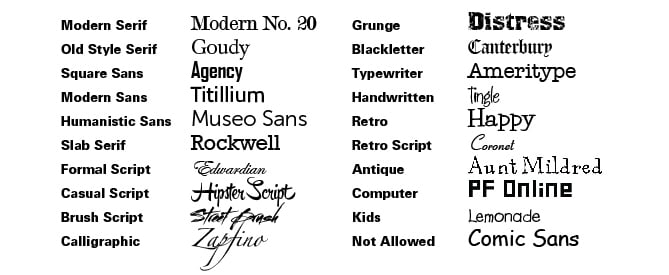 Some basic font categories. It has been estimated that there are over 200,000 fonts.
Creating Brand Distinction with Custom Type Design
When designing a wordmark there are other considerations after choosing the font. In lieu of any accompanying symbol, it is important to create distinction in the wordmark logo with the appropriate design decisions. Examples: whether to use serif, san serif, upper case, lower case; what color, size and weight, etc…a designer may choose upper and lower case for more readability—the human eye distinguishes the letterforms more easily, at a glance, due to the ascenders and descenders and the difference in height between capitals and lower case. Color choice should speak to the intended audience and communicate the brand story, and also be easily readable. In many cases, distinction is achieved by custom typeface design. Typeface creation is an art, using solid design principles to craft letterforms that work with each other and express a certain flavor or feeling. Many wordmarks employ custom-designed unique fonts or letterforms. Here are some examples of custom calligraphy and hand-lettering:
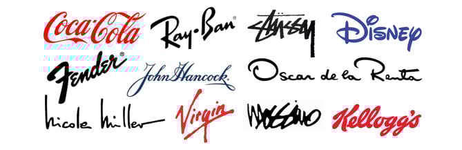 Figure 4. Wordmark logos created with custom typography, handwriting, or calligraphy.
The Twist
Another way to create distinctive wordmarks is using a small simple tweak to customize the mark. It can be a ligature (two letterforms joining), a notch, a color difference, playing with positive/negative space, kerning or letterspacing (manipulating the standard spacing between letters) or basically any twist that makes it unique and different from the standard typeface. Research, intuition, and serendipity can uncover design and strategic masterpieces, such as in the FedEx logo, where letterforms create an arrow in the negative space between the E and x:
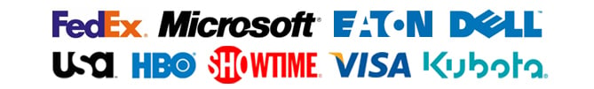 Figure 5. Wordmarks often employ a small design element or type treatment to make the mark distinctive.
Using Type as the Symbol
Typefaces contain many beautiful features, and sometimes a symbol can be created from entire characters, pieces of charters, and/or modified characters. Shown below are some wordmarks with accompanying iconic symbols made from letterforms. In the next post we will cover combination logos (type plus symbol) in more depth, but since we're talking about type, I'm including this unique category of logo here:
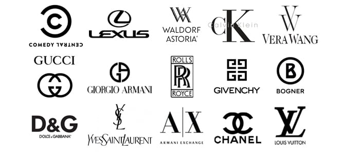 Figure 6. Wordmarks that employ a symbol made from type take advantage of the inherent beauty of the font.
Elegant, Sparse, Understated
In addition to the technology, automobile, internet and media companies shown in figure 1, luxury and fashion brands, clothing and home goods companies also frequently use wordmarks. In each of these logos, the absence of adornment and masterful execution—the choice of font family, typeface, the weight, case choice, letterspacing or kerning, and color—reflect the sophistication, class, accessibility or utilitarian simplicity of the brands:
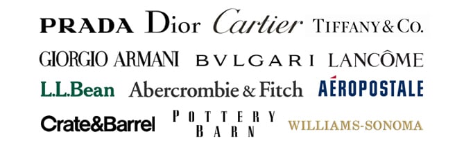 Elegant simplicity of luxury, fashion, clothing and home goods wordmarks.
Music. The final frontier.
Where would we be without the evocative typography and iconic wordmarks of our favorite music? These marks are a perfect fit—using genre-defining custom typographic design to reflect the personalities of the musicians and the flavor of the music, helping to create or inform the brand of the band:
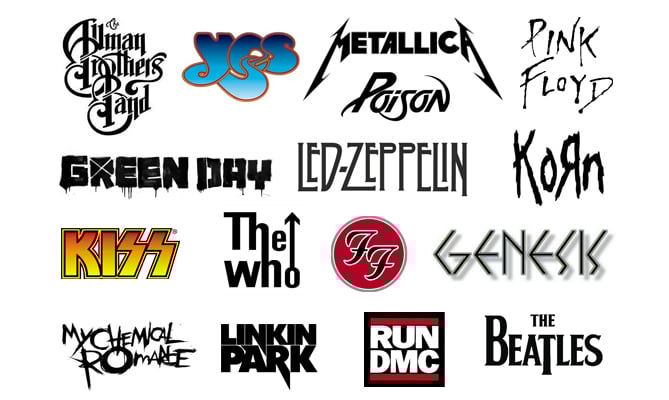 Iconic wordmarks of high-profile rock, pop, thrash, metal, and hip hop bands.
What's Next?
In my next post, we will explore logo design that uses words and symbols together, combining the best of both worlds, distinctive type design married with iconic imagery.