
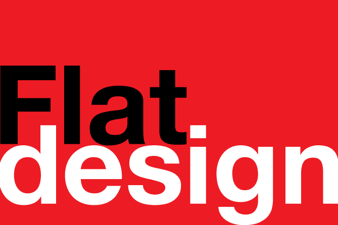
What is Flat Design? Flat design is a simple graphic style now popular in all applications of design—user interface (UI), software, web, electronic, broadcast, and print. It is sometimes defined as the opposite of, or contrasting to three-dimensional or realistic images. It features simplified colors, shapes, images and typography. The design goal is to reduce distraction, facilitate readability and speed up a consumer’s absorption and comprehension of a marketing message.

My first conscious clue to this trend was when Apple introduced iOS7 for the iPhone and iPad. The icon design changed to a flat, minimalist approach. Which is an awesome direction. As a designer, I love it. No more trying to create that bulbous reflective sheen on everything to stay hip and connected to the “app look.” That’s so 2013. I have to admit, it took some getting used to—about three days—but now the glass button icons that ruled our world for years look more out-of-date than a bottle of ‘Lectric Shave.
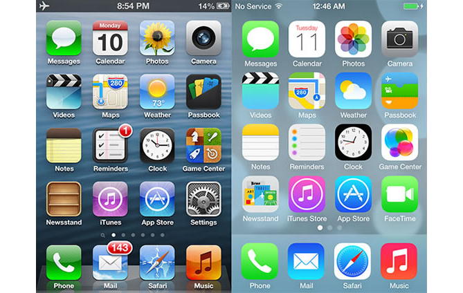
The new iOS7 for iPhone and iPad with a flattened icon set, simplified colors and no dramatic gradients or glossy sheen.
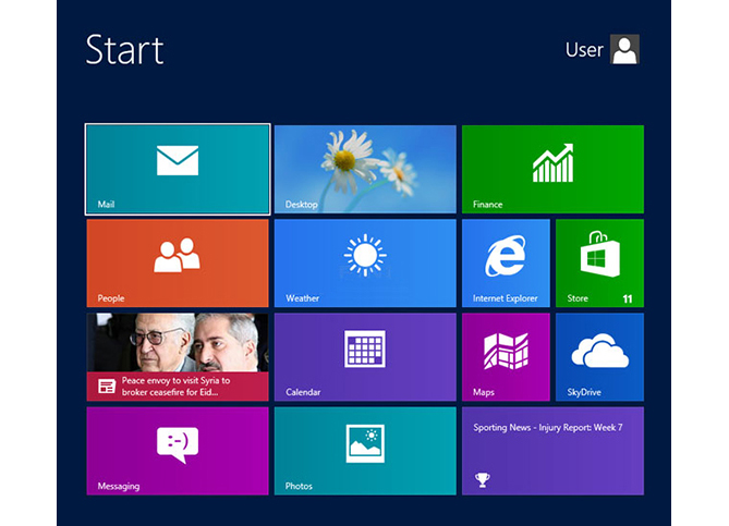
Though I hate to admit it as a Mac guy, It can be argued that Windows 8 ignited this trend in late 2012, with their flat colorful panels, stark typography and simplified graphics.
Eschewing the Skeuomorphism Paradigm
Wow. That was a mouthful. Skeuomorphism refers to a design style in which you use visual and structural elements and functionality features from an original, real-world tangible object when creating something new that has a similar or identical purpose. For example, Apple’s photo of a vintage microphone for the iPhone voice recording screen; or an iPhone case that looks like an audio cassette. Skeuomorphs are often used to make something new look familiar and comfortable. They are also used by hipster designers to juxtapose vintage or classic styling with state of the art technology. Since many of the design conventions of yesteryear’s products made in nineteen-tickety-two have a kitschy, retro appeal, it was a fun way to design a web interface or product. But now designers are leaving this simulated wood grain paneled 1970’s station wagon for the brave new world of flat design.
But…it’s nothing new
It feels to me like we’ve come full circle evolving and refining marketing, design and advertising strategy. And we continue to drive in circles, but we ARE getting somewhere. Design has always been cyclical, always borrowing from the past or rejecting the past to create the future. Art Nouveau, Art Deco. Modernism. Post Modernism. Impressionism. Retro chic. Steampunk. Each movement departs from, yet depends on, its predecessor.
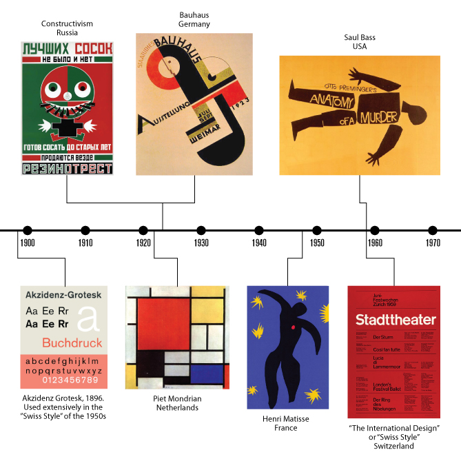
Flat design is nothing new. It has its roots in several design movements of the last century.
So from my admittedly limited, late 20th-century perspective, I see the new flat design trend as a return to, or borrowing from, several design movements from the last century that have been some of my major influences: The 1920’s simple shapes and bold colors of Dutch painter Piet Mondrian, and the clean lines, simple shapes, bold colors and ordered layout of the Constructivists; the Bauhaus starkness, geometry and typography of the 20’s and 30’s; the 1940’s bold colors and cut paper art of Matisse; the simple elegance of the Swiss “International Style” design of the 40s and 50s; and the 1960’s graphic design of Saul Bass—flat simple representational shapes and iconic color imagery. The “new” flat design trend has hints of all these, but with a modern, minimalist, futuristic sensibility that I can’t help but love.
But why change now? Why revisit or re-invent “flat” design? What else is driving this trend, especially in website and UI (user interface) design? The answer seems be that with consumers’ growing maturity and web-savviness, we no longer need to be greeted with icons and buttons that look “clickable” or are made to represent the item we are accessing, like microphones, mail envelopes, and cameras. Those delicious little icons served their purpose, they worked well at the time and helped an entire generation become more comfortable with the Internet and personal computers, especially with the advent of touch screen technology. Entirely new devices like the iPad and iPhone were armed with graphics that were sure to make someone touch them in the right place. But now we have been pushed out of the nest. And even those of us that make a living on computers and the Internet may have found it awkward in the first few days after iOS7, searching for the familiar 3-D glassy bubbles to push or click for the information we needed…but not for long. And as a designer, I find it graphically appealing, and comforting to now be using these familiar devices with such a simple, clean, almost “print design” interface, like touching flat graphics on paper. And one of the basic principles at work here is that if something’s beautiful, uncluttered and looks easy to use, someone is more likely to engage. Imagine that. How new.
Flat Design Color Trends, Web design and Typography
As I touched on earlier, rich color palettes are key to making flat design interesting and appealing. Checking out the why and how, I discovered there’s a whole science to this. I’m not surprised. That’s why I love writing blog posts—I learn something new. Here’s a great article that goes into quite a bit of depth on flat design color use.
The flat website design trend continues to grow. Gone are the 3-dimensional, realistic shapes. Now everything’s flat, simple and big. Including type. Partly as a response to the resolution of today’s monitors, typefaces are larger for legibility. People respond better to, and are encouraged to explore further, sites with quick and effective communication using clear and clean type. No more three-dimensional beveled shiny mirrored fonts jumping off the screen giving me a headache. Gone into the trash bin that also contains 1995’s flashing rainbow type GIFs.
I’ve always been a fan of simple, sans serif type, so I am really liking the way typefaces are trending these days. When I was in graphic design school, we had a typography expert come in one day and lecture us. Half the people were falling asleep, but something about that conservative-looking type nerd stuck with me, and I’ve been type-obsessed for my entire design career. First, there is an inherent beauty to all letterforms. And each font treats them differently. A whole lot of design has been concentrated on each character. How they interact with each other affects the human eye and brain’s ability to process their information. Second, organizing type into a coherent layout, with proper size, leading, surrounding space, visual hierarchy and color is an art, with the goal of having another human respond favorably to your intended message. Good writing doesn’t get read unless it’s presented with clean and clear design. That’s why I like flat.
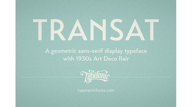
Ahh…modern san serif elegance with a touch of classic.Here’s an example of what type of face may stand out in the new crowd.
Be Aware of Trends, Not a Slave to them
Obviously each client’s design project brings its own set of criteria to the table. We are not tied to trends, but need to maintain awareness of what’s happening in the world. It’s an ever changing evolution of taste, preference, and popular opinion that shapes the public’s visual vocabulary. The most immediate and pervasive influences that I see are in television advertising. The latest typefaces, color palettes, motion graphics, photography styles and the design of the products themselves are burned into the conscious and subconscious minds of every viewer. We are shaped by those images and experiences, and may be influenced—positively or negatively—by marketing that follows those trends. We’ve all seen it before…a trend emerges, and suddenly every other ad on the tube is imitating it. Last year every car commercial I saw had type that appeared out of nowhere and looked like it was swinging on a clothesline. Wow. How did they do that? Now I don’t see it anymore, and I’m sad. I want to swing.
Bottom line, whether a designer uses a trendy typeface or not, how someone responds to advertising and marketing messages is still facilitated by timeless classic design principles. Or impaired by ignoring those principles.

