
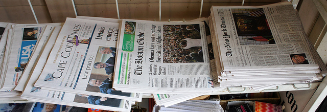
CSS3 has some great tools for graphics, text and even animation, especially when combined with HTML 5 markup language. Here’s one CSS3 trick that makes it much easier to do something old school. Text columns. If you look at a newspaper (quiet hipsters, they still exist) you’ll notice that they break up their text into columns. Some columns are wider than others, but they tend to be roughly three inches wide on average. This makes the text more readable to the human eye. Instead of having to follow a line all the way across the screen, where a small distraction might make you slip a line, shorter lines make it easier to return to where you left off before you looked at the picture in the story or an ad to the side. To make best use of today’s large screens, readers prefer limited-width columns of text placed side by side, just what newspapers have always provided.

A few considerations
There are a few things to consider before trying to use columns. If your website is responsive, you’ll need to use media queries to prevent or reduce the number of columns as the screen size becomes smaller. You might have three columns for a desktop, two for a tablet and one column for a phone. You’ll also want to have very specific control over it. If you’re applying it to an existing website, I’d recommend that you create a special style for it to avoid having it apply to existing content in unexpected places. Obviously, you don’t want to have it applied to headers and the size of images embedded within content will be a major factor.
The code
The CSS code is very simple. These three variations cover all of the major browsers:
p.columns{

-moz-columns:3;

-webkit-columns:3;

columns:3;

}
How to try it
Try applying it to your website little by little, starting with the content that has the most human eyeballs looking at it. The search bots don’t care about your columns, but your human fans will.
——–- Photo License
-


 Some rights reserved by vbecker


