It’s that time of year again, when we look back at some of our favorite fonts to emerge during 2011. This year’s top ten list (in no particular order, by the way), includes some stylized fonts, some hand-drawn and script fonts, and some lovely sans serifs. Click on the pictures to go to any font’s display page on MyFonts.com.
Pluto
Pluto is one of those fonts that had immediate appeal to designers, and spent a lot of time in the top-fonts list over at MyFonts.com. Its friendly curves and solid design make it great for all kinds of applications, from light and humorous to serious and professional. I wouldn’t be surprised to see it popping up in lots of print and web pieces over the next couple of years.
Reverie
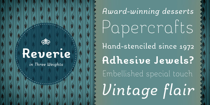
A font that could be a cousin to Pluto, Reverie is fun and friendly, and lends itself to a variety of uses, including logos, headlines, and even short runs of text. Some fonts sit on my harddrive for months before I use them; Reverie saw action almost immediately after I bought a license.
Carolyna Black
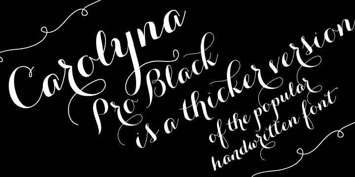
Carolyna Black is a lovely and unusual script font. It’s a rare script that retains the flavor of being hand-drawn while also being precisely crafted to work flawlessly in professional usage.
Waldemar
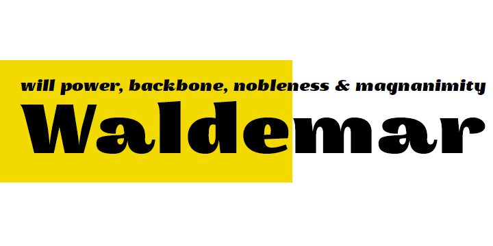
Waldemar is a big, bold font with plenty of flair. It works great for headlines and packaging, and has a wonderful friendly touch while being strong.
Transitore
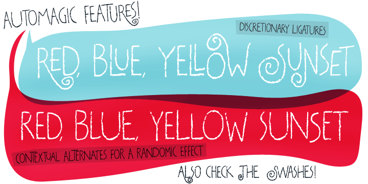
Just when you thought grunge fonts were passé, along comes Transitore. It’s a fun, hand-drawn font, with a great complement of ligatures and contextual alternates, so that it actually looks hand-drawn in use.
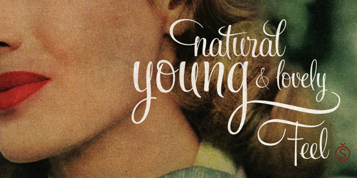
Feel Script
Everybody’s favorite script foundry, Sudtipos, came out with some beautiful fonts in 2011, but this is my favorite. Feel Script is a wonderful, upright calligraphic font, complete with a professional set of glyphs including alternates, ligatures, and ending forms.
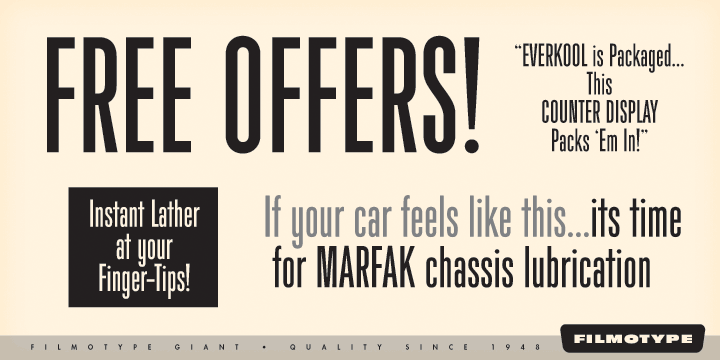
Filmotype Giant
Who doesn’t love a good tall, condensed font? Filmotype Giant is great for headlines, posters, and ads… Anything that would benefit from a bold font that fits a lot into a little space.
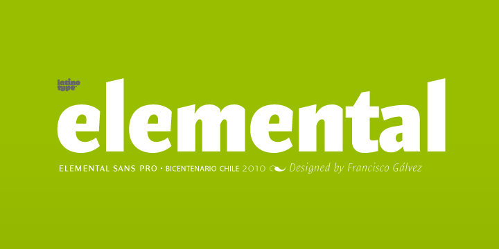
Elemental Sans
I’m usually not wooed by humanist sans serif fonts, but Elemental Sans won me over. It’s a unique sans that will look legible and professional while retaining some character.
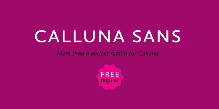
Calluna Sans
From Jos Buivenga comes a sibling to his popular Calluna serif font: Calluna Sans. It’s another humanist font that melts my anti-humanist bias. The font works beautifully at all sizes and in many applications. A real workhorse that also happens to be a show-horse.
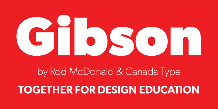
Gibson
Ah, a more geometric sans to fit my sans serif biases! Gibson is a great piece of work, and is, like Calluna Sans, utilitarian while also retaining its own character.




My 10 Favorite Fonts of 2011 | Change Conversations http://t.co/MEtEpwRp
Loving Calling RT @pheffernanvt My 10 Favorite Fonts of 2011 | Change Conversations http://t.co/gVZVkGod