When I was very young I was fascinated by logos. The bursts of color and energy of tiny oil company logos on the backs of my mom’s credit cards, the clever, illustrative Velcro logo and the negative and positive space of the typographic Eaton logo. In 1974’s Miami Dolphins vs. Minnesota Vikings Superbowl, I chose my favorite team based on their logo’s color scheme. It was Miami’s Turquoise and Orange. As a teenager, there were rock band logos–I reproduced the Aerosmith logo perfectly in black marker on my school notebook; network TV ID’s–the 1960’s NBC Peacock, the CBS “eye” or the mid-Seventies abstract NBC “N”? And of course, cars.
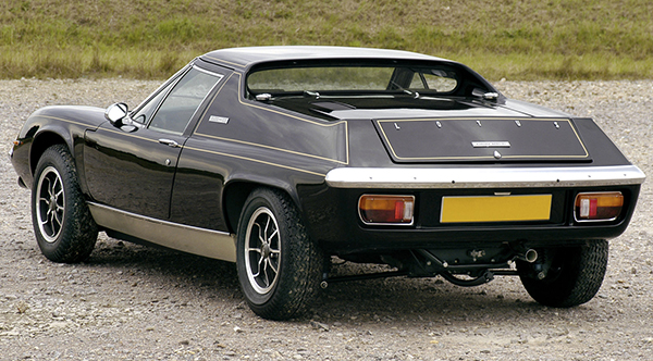
My earliest auto logo experience was Volkswagen. An elegant combination of V & W. I was three, staring at the center my father’s VW steering wheel. I couldn’t spell yet but I knew letters and was fascinated with the forms. In 1974 I saw my first Lotus, and fell in love. With the car AND the branding. L-O-T-U-S letterspaced across the tail of the exotic mid-engine Europa. Seeing a car’s logo conjures up my history of images and fantasies–what that car meant to me. The reputation of their brand that had accumulated in my psyche. Their story as told to me so far.
A Few Years Later
Lately I have been noticing car logos are getting bigger. Badges, as they’re called, are inching up in size, competing for attention in the already-crowded marketplace in my head. How big will they get? When will the madness end? My favorite brand, Toyota, has increased the size of their badge on the RAV4 over 50% in the last 10 years. It is the latest symptom of the annoying, sometimes-fatal disease logoenormosity. Sometimes known by the latin term logos giganticus. Known in Europe as supersizemeitis, a variation on Mines-Bigger Syndrome.
I kept my eyes open while driving recently, and almost every brand is doing this. Apparently the disease is communicable and spreading fast. And it’s been incubating for awhile. As early as 2008, cars.com reported on this trend: Dodge announced at Detroit auto show that the Ram-head logo on its namesake pickup is 250 percent larger than before. Asked if the badge had reached critical mass, designer Ralph Gilles chuckled: “It’s about there.”
Is Bigger Better?
As a designer who has created many logos, I should rejoice if a client wants to make the logo bigger. I designed that logo! A bigger logo will rain all sorts of heavenly glory down upon me, and of course, the client’s business will improve directly proportional to the size increase. Right? Not necessarily. A loud and out-of-place logo can be an egotistical bully, overpowering, selfish, shouting “Look at me! Look at me!”, beating you over the head, implying you are not bright enough or attentive enough to see it and get its message if appropriately sized and tastefully implemented.
Bigger is not always better, louder does not always tell a brand’s story well. Does a bigger logo mean more sales, more brand awareness in the marketplace? In fact, it may hurt the brand. Last year I refused to even consider purchasing a 60 inch plasma TV which featured a backlit logo on the bottom bezel. Do I really want to see a logo while I watch a TV which already has logos coming at me every 5 minutes, as well as the ever-encroaching network bugs in the lower right corner? No. Many times I have refused purchasing some article for the house, not wanting our home to be filled with logos staring at me all day and night. When I find a beautifully-designed product, more often then not these days I am disappointed to also find a logo screaming out at me, distracting me from the clean lines. Preventing me from buying it. Instead of reinforcing the brand’s image of beauty, clean design, reliable construction, the inappropriate logo is distracting, annoying, sometimes downright ugly.
However, maybe I am a hypocrite. I am happy to display my camera’s brand with a bright yellow logo on the strap. Secretly I am proud not to own “that other camera brand”. Like the Chevy vs. Ford rivalry. The logo wars. My carbon fiber bike is all logo, and I am fiercely loyal to my brand. I used to laugh at riders with logo-plastered jerseys, thinking they were Tour-De France wanna-be poseurs, until I became a serious rider and found really cool jerseys with Nasa logos, my favorite rock bands and even breakfast cereals.
Good design, sound marketing principles
Branding is about the whole picture. A good logo is just part of that picture. If a big logo were enough to get your message across and/or sell your product, you wouldn’t need a copywriter, solid research, well thought out design, or intelligent product development. Good design is about proportion, composition and balance, on target with good marketing research. In the age of information overload, which is now on steroids, if your message lacks white space, balance or clear eye path, you risk losing readership. There is a reason great companies employ great design. It is the persuasive, seductive messenger for an informative, exciting, important message. Sophisticated and reserved sends a strong message about brand confidence. Properly sized, a logo is a signature, not the letter. It is an emblem, not a billboard. It draws you in, it doesn’t drown you out. It speaks with strength and confidence, it doesn’t yell, talk over you, or talk down to you.
Obviously there are some markets where more noise is appropriate. If the research shows your desired demographic rocks thrash metal and branded apparel, have at it. Go crazy. I’d love to design a full-length iPod-wired jumpsuit with a six-foot flashing LED logo. But we don’t have any clients like that yet.
Lotus Image courtesy of: http://www.netcarshow.com/lotus/1965-europa/1600×1200/wallpaper_03.htm
[/fusion_builder_column][/fusion_builder_row][/fusion_builder_container]


For the Love of Logos | Change Conversations http://t.co/I4VIO0jy