

Decisions, decisions. Color choices shape our lives every day. We choose colors for our clothes, cars, walls, towels, dishes, even pets. We are surrounded and comforted by our choices, inundated and influenced by the colors we encounter in our environment. Color affects our mood, our actions, our quality of life, and our buying decisions. It is a powerful communications tool, and we as communications professionals must use color effectively to achieve the desired results for our clients and their customers. Volumes of resources exist about color in design, advertising and marketing, color production standards, and color management, and the vast areas of psychology of color, eye physiology, color perception and color theory have been comprehensively explored and explained elsewhere, so I am not going to try to summarize any of those here. I just want to have a little fun playing in the crayon box, and pass along some interesting links.

The Color Association of the United States website
The website of The Color Association of the The United States features articles from various sources around the web about color in fashion, autos, toys, our environment, music, food & beverage, technology, furniture, and more. Visit them and take a daily stroll through all the ways (some you may not have thought of) color affects our lives.

Interaction of Color, Josef Albers’ masterpiece, is now available for the iPad
Josef Albers’ famous masterpiece, Interaction of color, is now available as an iPad app from Yale University Press. Published in 1963, the massive book (more of a resource collection) contained more than 150 printed silkscreen color studies, volumes of commentary, color philosophy, and theories about relationships between colors that are still taught at art schools around the world.
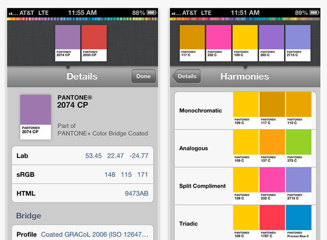
Screen grabs of the Pantone iPhone app
Another color resource—Pantone, the industry standard color matching system—offers color systems for graphic designers, fabric and textile designers and interior designers, available in hard copy reference books, kits and systems, and also in apps for the iPhone and iPad. What a great idea for those of us who sit at traffic lights and ponder the PMS color of Vermont’s green road signs. Pantone also recently jumped into the pool of our lives at home with paint colors and home furnishings. What PMS color should we paint our new home office? And what designer’s office would be complete without the steaming cup of organic Peruvian Pantone 7461?
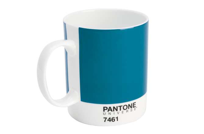
Pantone Coffee Mug in PMS 7461
Oh, and before I forget—a certain obscure tech company recently announced that their iConic phone/camera/rolodex/map/email/personal trainer/organizer/therapist thingy is now available in colors:
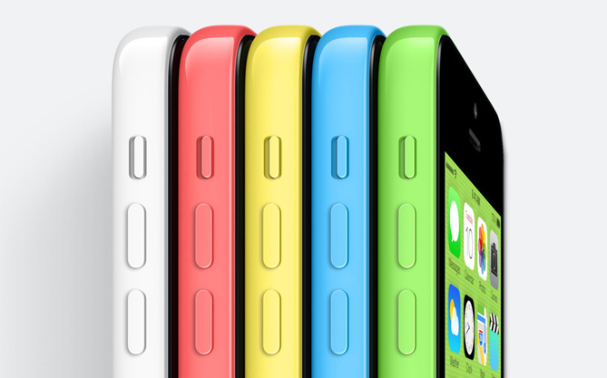
NOW! Available in living color!
And a personal favorite, American Public Media’s The Splendid table, recently ran an article that resonated with me as an amateur home chef regarding color in our food, The ROY G BIV diet: Eating one color of food each day. Apparently my diet choices as a recent couch-ridden, tv-watching flu sufferer, did not conform too well. Everything was yellow, tan or white.
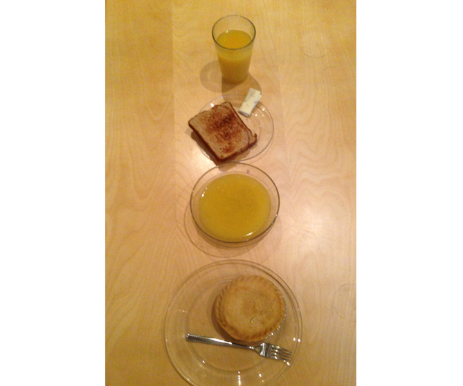
Colors: Toast: “Amber Russet”; Orange Juice: “Languid Sunset”; Soup: “Afternoon Whispers”; Chicken Pie: “Wheat Breeze”
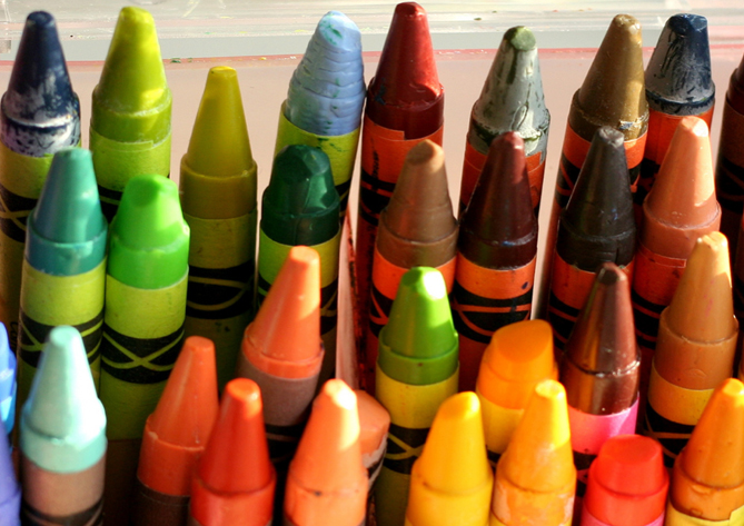
Screen grab courtesy of CAUSnow. Photos courtesy of: Potion (Interaction of Color); Pantone (PMS 7461mug); Apple App Store (Pantone iPhone screen shots); Rene Ritchie, imore.com (iPhone colors); Matt Black’s black iPhone 5S (Brad’s monochromatic meal) Crayons: http://www.flickr.com/photos/aidanmorgan/2574312204/


Brad,
I’d like to take you up on that “eat one color of food everyday challenge” – especially since your flu-suffering, monochromatic menu doesn’t look at all appetizing.
Great post as always, PB.
HI Pam, Thanks for reading! In retrospect, if I ate more than one color of food when I was sick, maybe I would’ve hastened my recovery. Also, it occurs to me that there are no black foods mentioned in the Splendid Table article–black olives, poppy seeds, black rice, beans, blackberries, black tea, nori…