
The mighty Call-to-Action: Working hard to motivate people since the dawn of marketing
I learned about creating an effective call to action many years ago as a direct mail designer. Traditional direct mail promotion involved a multi-step process: advertising with calls-to-action that included company phone number and address and a response device to gather lead contact information, ad tracking codes to test different publications’ response rates, list generation, first response packages to generate more qualified leads, and second response packages or other techniques to close the sale.
Most of us can remember direct mail packages that included product or service information, pieces of paper with special offers, coupons, multiple calls-to-action and the response device, usually a return postage-paid postcard or business reply envelope to mail back a form with contact information. The media has evolved, but the purpose and goals are the same: make it easy to act, generate qualified leads, get enough information to follow up with those leads and ultimately convert them into customers. Nothing about the call-to-action has changed, except there are fewer confusing bits of paper falling out of envelopes, floating to your living room floor.

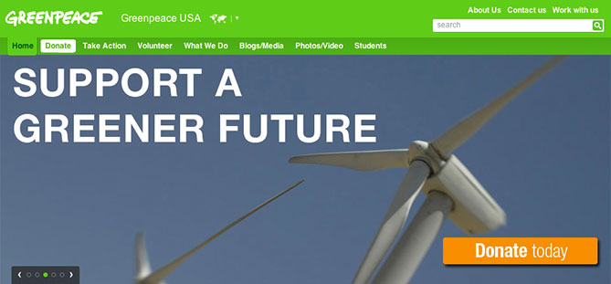
Clean layout, eye catching color, sense of urgency and imperative text in the button make this CTA a winner.
Whatever the media, the Call-to-Action should be clear
Most TV ads feature a call-to-action, whether it’s an infomercial type of product marketing with a hard sell “call 1-800-something in the next 10 minutes and receive not one, but two…”, image advertising with a suggestion to “visit your nearest dealer today” or product or service ads that drive people to company website, sometimes imitating the web experience with an animated cursor arrow that clicks on a button with a URL, like “buyatoyota.com”
Traditional print advertising has always featured some version of the call to action, and it is now standard practice to drive that customer to the company website. Websites and blogs need effective and prominent calls to action as they have become the primary vehicles in inbound marketing methodology.
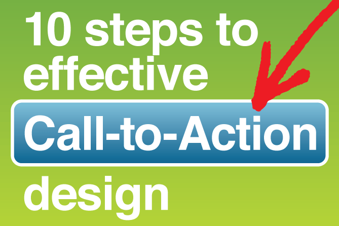
10 steps to effective Call-to-Action design
1. Explain the product, service or offer well.
Give the visitor a reason to respond using the CTA. Personalize text with a benefit-oriented message appropriate to the audience.
2. Make sure your Call-to-Action is easy to find.
Eyepath, white space, proportion, contrasting colors all play a part in making it stand out. Don’t assume prominent positioning always means lower right—it may be top right, or front and center.
This home page’s CTAs are prominently displayed high on the page, a different offer specific to each slider photo
3. Make your Call-to-Action attractive and inviting.
Be creative. Employ unique, surprising graphics that work with the page design or compelling photography that shows the product or tells story of the offer.
4. Make it clear what you want your potential customer to do.
Direct them using imperatives, action words. Don’t be passive.
5. Don’t be too aggressive, limiting or high pressure.
For example, pop up windows that prevent someone from viewing a page are obnoxious and can cause visitors to leave the site.
6. Your offer should be no cost, no obligation, no strings attached.
A free trial membership, for example. Be aware that asking for too much information, requiring too many fields to be filled out, either in the call-to-action or the following landing page, can stop people from engaging. The information requested should be commensurate with the value of the offer.
7. Embed an offer, benefit, or information in the clickable link.
Pack the button with value, not the space-wasting “click here”. You can add more information to text inside button or next to button to tell the viewer, for example, how long it will take: “Get Started (it takes about 20 seconds)” or what to expect: “Download Now (and start your 30-day trial)” or lists the added benefits: “Subscribe Today (you’ll save $20)”
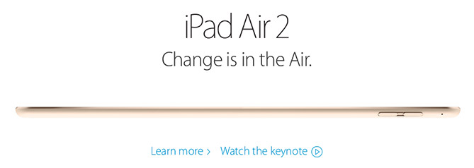
Apple is known for their beautiful typography. These two calls to action are elegant, sparse and give the visitor a choice.
8. Give a visitor some options.
Use two buttons (“sign up for free” and “take the tour”) or use a button for one offer with the text of another offer near that button as a clickable link. You can then emphasize the one you’d like them to click on first, using design and layout options.
9. Communicate a sense of urgency.
Encourage viewer to respond now. Perception of limited supply or limited time is an effective motivator, due to the social-psychology phenomenon known as the scarcity principle. It’s also effective to make an conditional offer, e.g., “order by December 1st and we’ll pay the shipping”
10. Don’t distract your visitor with too many choices.
Multiple CTAs on one page are okay, unless you pull the visitor in too many different directions. Limit the visitor’s choices and there is more chance they will respond. Make sure each offer is clear, has a focus and requires a distinct action. Some would recommended putting a call to action on every page, while others advocate only putting them on high-traffic pages. Either way, keep in mind a website is a marketing vehicle—not only a “look at us and our capabilities” showcase—and should have a variety of benefits and offers for a visitor in every category of the site. Something to engage, educate, motivate the potential customer and help return your investment.
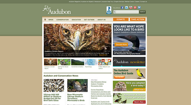
Multiple CTAs on a page, each focusing on a specific story with unique benefits or offers, and distinct directives.
Answering the Call for your Marketing Success
Motivating people to act—to purchase a product, contract for a service, volunteer in the community, or contact their legislator—all starts with a clear message and call-to-action. Effective UX (user experience) design is all about making the customer happy and loyal through ease of use as they interact with your website, blog or other marketing materials. It’s all about them. And it always has been, regardless of the media. With the current technology we are blessed with more tools than ever before to make that experience seamless, rewarding and memorable.

Hi Brad, great post you’ve got here. I bookmarked this one because it is really helpful especially for my research about the effectiveness of call to action to any small business sites. I also find this post http://www.lionleaf.com/blog/make-sure-all-your-pages-have-a-strong-call-to-action/ helpful and interesting but I prefer your ideas better. I just have a question. Do you happen to have any tips for newbies in the industry on how to effectively write or include call to action in their website?