
Why you care about typeface choice
 You understand typeface choice is an integral part of good design and clear communication. Whether it’s online advertising or print, packaging or logo design, you know a typeface says a lot about your brand, and must be thoughtfully and carefully considered. Typeface choice is an essential part of logo design because each face imparts a personality to a logo that should reinforce your brand. Similarly, typeface choice in a company’s communications—part of its corporate identity specifications—needs to reflect the tone, look and feel that has been established to tell the brand story. Since type is one of the most important vehicles in conveying a marketing message, the particular typeface and family used must reinforce that message, not conflict with it. Let’s consider three questions you can ask to help you make your choice.
Can you read it easily and quickly?
Not only do we need to consider the look and feel of the type, we also need to make sure it is readable. The legibility of a typeface—its distinguishing form and features—can help or hinder readability. Other factors to consider are upper and lower case versus all caps; serif versus non-serif; line length, leading and size; italic or roman; typeface weight (thickness or thinness); color, and contrast with background. Any or all of these can dramatically affect readability, and differing media—web, print, broadcast—each bring their own set of requirements to the table.
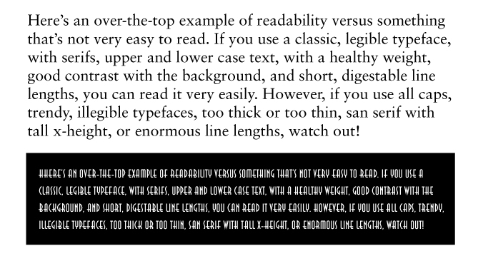
Type readability: best and worst cast scenarios
Is that typeface overused or outdated?
Regardless of the typeface features that have been scientifically proven to contribute or detract from readability and legibility, typeface choice could be communicating other messages loud and clear: a marketing effort that looks dated or, overused or cliché type styles that fail to distinguish a business. There are no hard and fast rules, however, since one person’s outdated or overused font could be the perfect design solution for a particular project if used effectively. Here’s an example of popular typefaces used over the last 50 years in television show titles:

Typefaces that were popular during the time these shows were on TV may or may not be past their prime
As you can see, some typefaces have a distinctly dated look and feel, while others have stood the test of time. The swooshing serifs of All in the Family, Hill Street Blues, Family Ties and the Golden Girls scream of a dusty, frumpy bygone era; some of the shows in the sixties have a fresh retro punch; the 1990s shows are, well, definitely from the 90s. Refreshing typography is a result of not necessarily using the newest typeface available, but staying away from the dated ones and those that are way overused. Classic, well-designed typefaces (or new, distinctive, appropriate ones) along with using sound strategy and good typographic design—innovative layout, color choice, kerning or letterspacing—ensures a contemporary look with sustained longevity.
Does it offer the timeless beauty of good design?
Some typefaces have been around a long time, but their timeless design and perfected letterforms still work well today. Here are a few examples of san-serif classics: Gill Sans was created in 1926 and still has a fresh, contemporary look. Nobel was created in the early 1930s and its perfection and clarity inspired several current type designers to revisit it, adding a variety of new weights and minor aesthetic tweaks. Avenir is a recent design (1988), but it’s based on a face created in 1922. Akzidenz Grotesk was designed in 1896 and has enough variety to never go out of style.
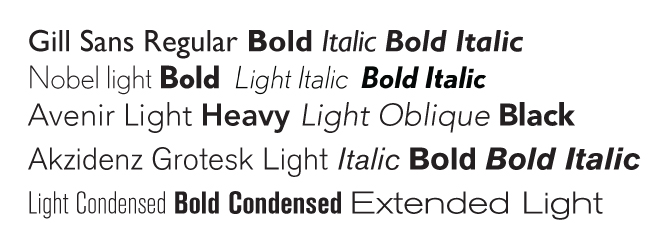
An assortment of san-serif typefaces that are still as fresh as the day they were born
Typeface Choice: No one right answer
The web is littered with treatises on classic faces and horrible fonts to avoid. While some of these ARE non-negotiable, the essential requirements of effective typographic design are awareness, intuition, flexibility, experience and due diligence. The laziness that compels one to use a tired cliché or “whatever’s available on my computer now” has no place in the formulation of a strategic branding plan for a vibrant business.
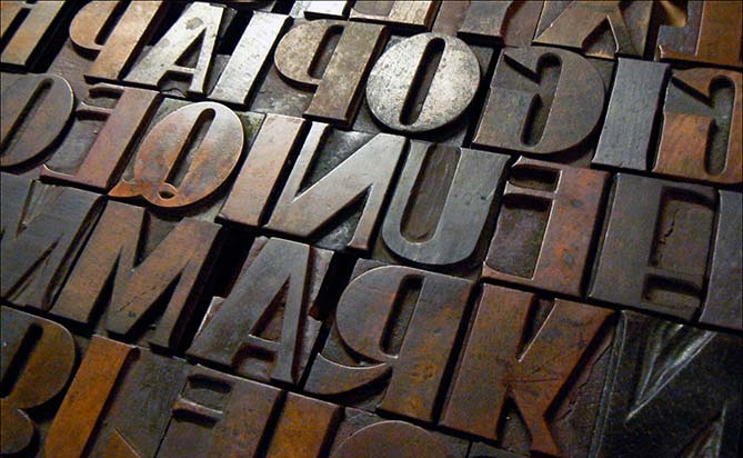
—— Photo credit: Woodtype image from Saint Mary’s University blog post on Hamilton Wood Type & Printing Museum: http://smumn-cn.blogspot.ca/2010/08/case-of-wood-type-from-hamilton-wood.html