
 The infographic revolution has assumed control. Infographics are everywhere—websites, newspapers, magazine articles, television commercials, blog posts—and when done right, rightfully so. We have crawled from the dark forest of soul-numbing pie charts and eyelid-relaxing bar graphs into the colorful, joyous fields where facts, data, stories and statistics that affect us socially, emotionally and financially are given the place in our consciousness they deserve. Colorful, informative, surprising eye candy that we are powerless to resist as we seek relief from information overload with ever-decreasing attention spans. But what makes for an effective infographic?

One of the first infographics, telling a story with visualized data
The challenges of presenting data effectively are to make it interesting and understandable. Clear, easily navigable pieces of information are one of the most important goals of graphic design. So translating what could be boring sets of numbers, statistics, analytics, facts or ideas into compelling visuals called infographics draws on one of graphic design’s essential disciplines. As technology has enabled the exponential growth of all types of design, visual expression and content creation, the infographic has become more important, more sophisticated and ubiquitous as the amount of information we need to convey has also increased exponentially.
Why use an infographic?
- Get your message across quickly, tell your story more efficiently, increase reader response.
- Express complex data in a simple visual way, i.e., use data visualization to present complicated ideas and issues to layperson/public.
- Engage your audience, motivate and inspire informed, intelligent dialogue.
- Effectively communicate issues and ideas for change; raise awareness for a cause; educate, empower the audience to speak or act.
- Challenge or alter reader’s perceptions, thoughts, assumptions; cause them to ask questions, re-evaluate their beliefs.
- Achieve specific goals, e.g., celebrate achievements, raise money, gain followers.
- Infographics are shared more than most other produced content, they will help build links and page views.
- Magnify and clarify information, leave an impression, create a memorable experience.
Anatomy of Effective Infographic Design
As with all design and content creation, there are best practices, essential elements and effective techniques:
- Clear, strategic concept or idea.
- Know your audience, use appropriate imagery (and data) to engage them with well thought-out symbols within their visual vocabulary.
- Tell a cohesive story that is important, compelling, timely and relevant.
- Keep things simple, use only essential content to tell the story, practice good editing.
- Well-organized, accurate, valid data or statistics from focused research.
- Keep text short—remember, the graphics are telling the story.
- Have a strong title, clear layout, well-managed content space, good eyepath, clean consistent typeface use.
- Appealing visual style rich in creativity, imagination, use of color, unique imagery—beautiful and interesting enough to print, display and share.
- Emotional appeal is essential. Use humor if appropriate.
Many Types of Infographics
Once you finalize your creative concept and determine the story you want to tell, one or more of the following will be the best vehicle to realize your idea. Some of these categories overlap.
- Visualized article Take a lengthy piece of writing and make it visual.
- Process or Flow Chart Visually show the separate stages of completing a task, or display the steps of a process. Answer specific questions, give options. Can be humorous.
- Timeline Take the reader on a chronological journey using visuals.
- Location Use a map or some geographic visual with location points and relevant data.
- Numbers, Research Results and Data Visualization Use impressive numbers and visualized data to display specific research findings, demographics, and statistics.
- Case Study Share the results of a campaign or action pan.
- Useful How-To Info Explain something or answer a question by visually showing how to do it. Demonstrate expertise, competence, experience.
- Compare and Contrast Compare two or more things, in an “A versus B” style, so we can visually see their differences.
- Did You Know? Show collection of interesting related facts using visuals. Sometimes humorous, as in hip cultural icon posters.
- Photo Infographic Use beautiful or compelling photos to tell a story.
- Advocacy or Activist Educate/inform/raise awareness on problem or issue. Inspire dialog, motivate change, empower to act.
- Venn Diagram Illustrate logical relations between sets of data using intersecting shapes.
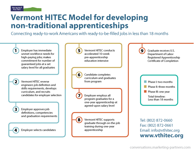
Example of Timeline and Process styles.
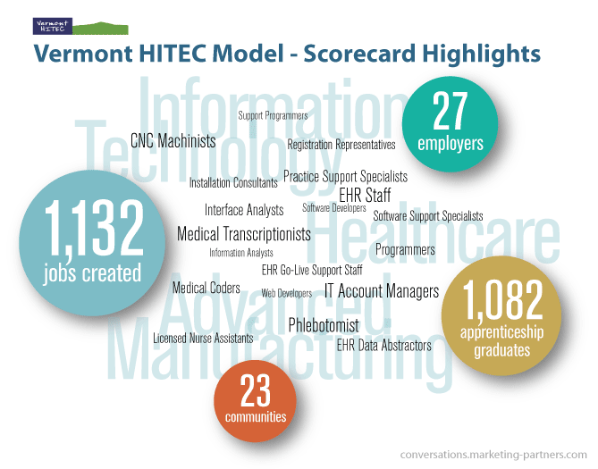
Example of Numbers! and Demographics styles
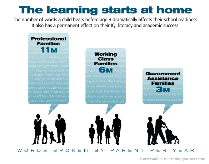
Example of Numbers!, Demographics and Advocacy styles.

Example of Numbers!, and Advocacy styles
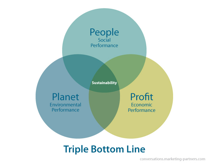
Relatively simple Venn diagram.
Infographics improve your life
In a typical day we are inundated with information from every direction: some valuable, some annoying, some worthless. Infographics are visual storytelling devices, high-information-density tools to help us comprehend, analyze and manipulate valuable, meaningful—ultimately USEFUL—facts. The essence of social math is to take large numbers we cannot relate to and translate them into something we can relate to. Not simply a pretty picture made out of numbers, a well-crafted infographic engages us, speaks our language with words and images we can relate to. Clean and beautiful design, intelligent imagery and accurate information fuse to tell us a compelling story, rewarding our participation with a life-enriching depth of understanding.
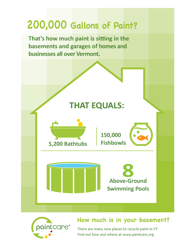
Social Math Infographic: recycling paint
Great Infographic References
The website of Jonathan Crum, information designer and science graphics editor at the New York Times, has a fascinating essay on storytelling with data, which is one of the best descriptions I’ve read of this process. It includes a diverse set of examples and in-depth personable narrative.
Edward R. Tufte, the master: The Visual Display of Quantitative Information (1983, 2001); Envisioning Information (1990); Visual Explanations: Images and Quantities, Evidence and Narrative (1997); Beautiful Evidence (2006).
Andrea Ovans, senior editor at Harvard Business Review, has a conversation with Gareth Cook, Pulitzer Prize-winning journalist, about his book The Best American Infographics, 2013.
KISSmetrics provides a healthy checklist for infographics in 19 Warning Signs Your Infographic Stinks
Credit for types of infographics:
http://piktochart.com/8-types-of-infographics-which-right-for-you/
http://visual.ly/types-infographics
http://www.dummies.com/how-to/content/examining-different-types-of-infographics.html