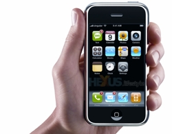
The old saying, “Less is More” applies to designing for mobile devices more than almost anything else I can think of. When you’re presenting information on such a small screen, you want to narrow your focus to as few elements as possible.
A Few Years Ago: Speed
Just a few years ago, in a time before smart phones, designing for mobile web meant that you were presenting very limited options with very little design. A “well designed mobile site” for a business, back in 2007, may have been limited to a search form, contact form, a click-to-call telephone number and a static map graphic with an address. It would be fast to load on a slow network and it would assume the user is on the move and possibly looking for the business.
Now: Small Screens
As phones became “smarter” and used better browsers, mobile design progressed rapidly. At this point, the physical size of the design area is more limiting than the technology driving it. Our fingers and eyes can only do so much with so little space. As science fiction as it seems, the next step could be a cursor that is controlled by eye movement, but lets not get ahead of ourselves.
Mobile Navigation
Navigation is another design aspect that changes quite a bit between desktop and mobile, since one uses a mouse and a monitor, and the other is a tiny touch screen. A cursor can point more precisely than a finger tip, and right and left clicks or a combination of keyboard and mouse clicks offer more flexibility than the touch screen. Expanding, squeezing and double-taps are a few of the interactions that can be utilized in mobile design, though from my observations, very few have taken advantage of this. Because these are relatively new interaction methods and smart phone browsing is still in a relatively fluid state, it may be best to let the dust settle before tackling new navigation techniques if the old ones are doing the job sufficiently.
Reskinning vs. Recreating
Do you need to create a separate website for your mobile users? Frankly, it depends on your website. If you have a complex website that runs on a Content Management System like Joomla or WordPress, you can easily install an extension that will take care of most of the work for you. You may have to do some configuration to get your content to display the way you would like it, but that beats re-inventing the wheel. If you have a complex website made from scratch, you will need to decide what content is essential, what is optional and what isn’t needed. If your pages are designed in XHTML and you use CSS to style pretty much every part of your website, you’re off to a good start. If you haven’t done this, that is where you’ll need to start. Once your styles are set, you can make a duplicate set of styles to be used when the site is being viewed on a mobile device. I have used PHP conditional statements and JavaScript to detect when a mobile browser is in use. I prefer the PHP method because it takes the uncertainty of JavaScript support out of the equation.
To use the PHP method, you simply insert a conditional statement in the document head where the call to the CSS files are, loading one set for mobile and a different set for desktop. If there are elements of the webpage you will never need to show, like a right column that has ads or other unnecessary items, you can simply set the style to “display:none”. This will keep it from displaying, but the code will still be executed in the background. If you want to be thorough about it, you could put a conditional statement around the content, so the code will be eliminated when the page is accessed on a mobile device. This will reduce the file size and help with the page load speed. It’s really a personal preference and judgment call on the designer’s part as to whether or not this extra work is necessary.
Navigation Design
Keep it simple and finger friendly. Look at some of your favorite apps on your phone. Notice how the controls (buttons, sliders, etc) are designed at similar sizes. If you are designing new navigation from scratch, you can style your navigation any way you want. You could, for example make your main navigation the same size as the number keys on your phone app and use icons similar to your app menus or you could use large type with Javascript to make expandable menus. If it’s possible, try to have at least an iPhone and Android phone available for testing. Blackberry and Windows Mobile phones would be nice to have access to as well. If you’re testing on an iPhone, use both Safari and Opera when checking your design.
Mobile design is just getting started and the devices are changing rapidly, so be prepared to adapt to new techniques in the near future. At this point, because it is changing so rapidly, making changes to how your content displays and how it’s navigated should be enough to put you ahead of most websites. And don’t get too bogged down in utilizing touch screen options that may be changing tomorrow.


