Round about 2000, I stumbled across a software project that restored my will to live. The MAME project was developing software that made it possible to run old arcade and console games on any platform — in simple terms, I could download their free software and run old arcade games on my PC. I grew up on these games, and had been very saddened by their disappearance over the previous years.
Of course, as with most things, the situation wasn’t as simple as downloading and installing some software — for one thing, MAME provided the emulation software to make all this possible, but not the games themselves. Finding games (and games with proper licensing) proved to be a challenge. But by far the bigger challenge was with the physical interface between software and user.
Arcade games came equipped with a dizzying array of joysticks, buttons, and flywheels, and in many ways the games were designed with particular physical interfaces in mind. Try playing Tempest without a heavily weighted flywheel, and you’ll be sorely disappointed in the results.
Try playing Robotron with a keyboard instead of two joysticks, and you’ll be cursing at the computer screen in no time.
I speak from experience.
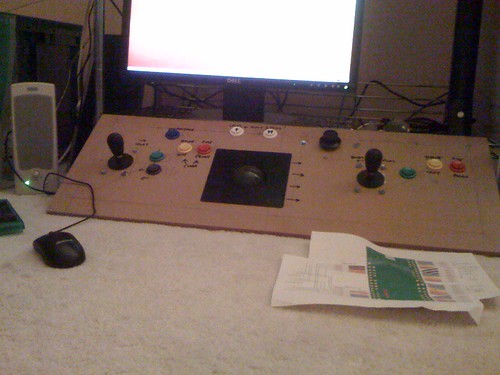
The solution — one I never undertook myself — is to build a control panel for your MAME emulator. If the computer keyboard and mouse don’t provide you with a good enough interface, build your own! Lots of people have done it. Check out this homemade rig:
The Right Interface
The lesson I take from this is simply that sometimes the right interface can, regardless of all of the wonderful features of a piece of software, hardware, or website, be the difference between a great user experience and a terrible user experience. While simple, I do believe that it is an oft-overlooked bit of wisdom.
Your website might hold the secrets to eternal life and happiness, but if users have to click more than two or three times to get to that information, your site will quickly be dead to them. If you’re building a new website, don’t rely on yourself to see if the paths to your information are good ones. Get people who aren’t familiar with the site to browse through it and see how they manage.
Your software might be the most useful programs in the world, but if it’s not also one of the most useable, you’ll have a difficult time selling copies of it. Again, good interface design and testing are paramount here.
Your hardware might do incredible things, but if no one can figure out how to use it, no one is going to buy it. Design and test!
Brilliant Interfaces I Have Known
iOS: Obviously, one of the great revolutionary interface schemes of the past decade or eight has been the operating system for the iPhone — iOS and its touch/swipe/tap interface. Scrolling by swiping, opening by tapping, selecting by touching, all has made the iPhone one of the great utilitarian and fun computer devices of all time.
Scrivener: Have you ever tried to use a word processing program to write a book? I have, and it’s not fun. Programs like Word and OpenOffice are good at handling one or two documents of a few pages each, but anything more and it’s an organizational nightmare. Luckily, I found Scrivener — an amazing piece of software that is built with the author and researcher in mind. It allows you to organize all of your research, drag and drop images from other sources, and provides you with a virtual corkboard that makes visualizing your project a breeze. When you’re done, you can export to Microsoft Word so that the poor suckers who don’t have Scrivener can see what you’ve done.
The Hand Blender: Tired of hauling out your huge, unwieldy blender, filling it with food, running it, and pouring it into a bowl? Break out your handy (literally) Cuisinart Hand Blender, and just bring the blender right to the bowl. Brilliant!


It’s All About the Interface | Change Conversations http://t.co/cwoqhoxI
Yearning for an improvement during my current techno hell> It’s All About the Interface | Change Conversations http://t.co/3pcFzF7b