
There’s nothing better than a well-produced infographic — a chart that simply and beautifully captures and displays a bunch of quantitative information that would take pages of text to explain in words. Some things to look for in a good infographic include quick clarity (the presenting of data in not only a lucid but also an immediately digestable manner), innovative quantitative display (using something besides standard bar graphs and pie charts to display your data), and overall beauty of design.
Here are a few of my favorite infographics out there on the Web.
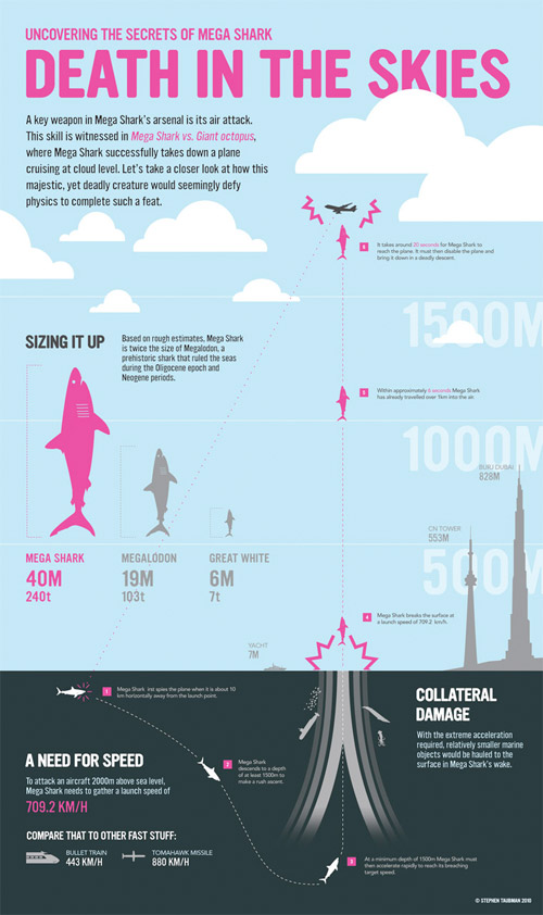
In a famously ridiculous scene from one of the worst movies of the last decade, the titular Megashark jumps out of the ocean and bites a large airplane in half. The infographic below — instead of just dropping some boring physics onto the page with some standard line charts — cleverly debunks the plausibility of the megashark myth via a lovely display of graphics and smartly presented quantitative information.

Next up is an infographic that made my favorite list despite its lack of immediate clarity. In fact, the information encapsulated — the relatively simple timeline of musicians who played in Pink Floyd — is barely worth charting, and so what makes this infographic so great is simply how it stylizes that information in a wonderful, fanciful, and entirely Pink Floydian manner.

This next one falls into the category of “information you really don’t care about,” but is so excellently presented that it actually makes you curious about the relative sizes of characters in Pixar movies. Imagine what the same infographic would be like as a standard bar chart — a long, boring collection of rectangles with a maddeningly burdensome key. By replacing the bars with the actual characters being analyzed, you’ve got immediate interest and aesthetic greatness.

This next infographic is a lovely and original presentation of information. It ingeniously uses variably filled rectangles to chart data that would generally be put into boring pie charts or bar graphs. Originality meets clarity.

In case you were wondering which countries have the most junk in orbit around Earth, this chart lets you know in stylish detail all about it. It’s one more good example of a clever presentation of data that would otherwise be shown via some mundane tool in the standard graphing arsenal.

Here’s one that encapsulates the social irresposibility of drinking bottled water, getting across a large amount of data in a single visually cohesive effort.

And we finish our tour with one of the most beautiful infographics I have ever seen — an original take on color spectra and names.

more infographic inspiration http://t.co/Aent7hlT
[…] Infographic can be found at: http://conversations.marketing-partners.com/2010/08/infographics-that-educate-and-inspire/ […]