
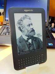
Amazon’s Kindle
I got a gift recently, one that I’m both excited and, well, quite honestly a little sad about: a Kindle. My excitement stems from my love of technology and gadgets, and all of the obvious benefits of owning an e-reader: easy access to tons of cheap books and periodicals, one tiny device that can hold a sizable library, etc. My sadness centers around the typographical problems harbored by this generation of e-readers, and the aesthetic and practical problems they are foisting upon us.
With websites starting to take typography seriously (finally!), it’s a little sad to see that e-readers are setting typography back a bit. I’m sure some of the e-reader problems will be solved in time, but, given that it took the web fifteen years to really start getting typographically savvy, it might not be all that soon.
There are plenty of posts out there about the bad typography of e-readers (here’s a good one). The basic problem stems from a key feature of e-readers: allowing users to adjust their text size. This means that there is no page, per se; e.g., if the user bumps up the text size of an e-book, the number of pages increases, and page one goes from, say, fifty lines of text to twenty. In a printed book, page one is page one, no matter what. The typesetter — hopefully a design expert in this sort of thing — has made page one look a certain way, and the reader can’t change this typographic layout to suit her whims or myopia. But, in essence, there is no designer of a typical e-book. It’s just a matter of dumping the text of the book into electronic form, and letting the device itself render that text based on user settings and whatever algorithms are programmed into the thing.
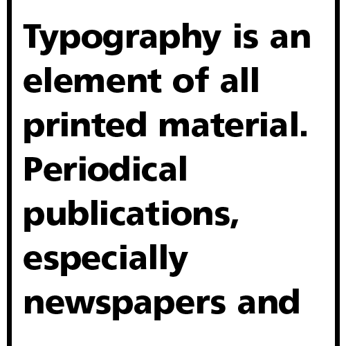
And e-readers do a pretty poor job of this rendering. Take, for instance, the problem of hyphenation. E-readers typically do not hyphenate their texts, and when you don’t hyphenate your text, you run into the issue of having huge empty spaces in awkward spots. Here’s an example of left-justified text without any hyphenation, at a large font size:
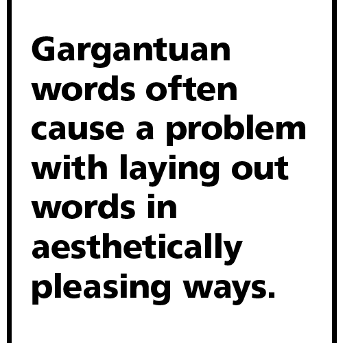
Left justified text, no hyphenation
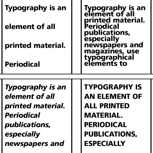
Not beautiful. But now combine this with the fact that e-readers typically fully justify their text (each line of text starts at the exact same left margin, and ends at the exact same right margin), and you get genuinely ugly typography. Observe how the situation gets exponentially worse with the same text fully justified on both sides:
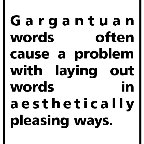
Fully justified text, no hyphenation
My computer tried its best here to algorithmically justify this text, but there’s really no great way to do the job (though I imagine one could do a little better manually than my computer did). There will always be ungainly spaces in odd places when you layout text this way, and this is how e-readers layout text.
Of course, text will seldom be displayed in such a narrow block with such a large font on your e-reader, but this is just an extreme example to show you one of the problems with e-reader layouts.
Readability
But it’s not just about aesthetics. It turns out that ugly typography is less readable typography, and this translates to slower reading and perhaps even lower comprehension. This study showed that “
There are many typographic variables that can be misused to deleterious effect for the reader. There’s leading (the vertical space between lines of text), kerning (the spacing between pairs of letters), tracking (the general spacing between groups of letters), and other factors such as line length, paragraph size, and faux pas such as setting text with too many uppercase or italic characters, just to name a few.
“Readability can also be compromised by letter-spacing, word spacing, or leading that is too tight or too loose. It can be improved when generous vertical space separates lines of text, making it easier for the eye to distinguish one line from the next, or previous line. Poorly designed fonts and those that are too tightly or loosely fitted can also result in poor legibility.” —from Wikipedia
Here (ignoring the overly-ragged right edge) is a decently laid-out block of text:
Well-spaced text
Compare that to the following examples, where we have text with too much leading, text with too little leading, text in all italics, and text in all caps. In all cases, readability takes a hit.
Badly-spaced text, and other transgressions
My Kindle Experience
As you might guess, my personal experience with the Kindle so far has been mixed. Frankly, I am no more distracted by its bad typography than I am by the typography of many of the print books I have read recently. (Perhaps it’s just the luck of the draw, but many of the print books I have purchased lately are set in very spindly, hard-to-read fonts. Disregarding this statistically insignificant trend, there is still the ever-present problem of bad craftsmanship in book layout. Any art form will have many incompetent practitioners.)
I like having a virtual book at my fingertips, and turning “pages” is luxuriously easy. I miss the unique tactility of print books — the cottony paper on my fingertips, the smooth cover, the weight of the thing that threatens to become ponderous depending on my reading posture. The sensation of holding a Kindle is like holding any other modern computational device — sleek, cool plastic with more or less the expected weight of circuitry within.
The screen itself, with its so-called e-paper technology, is definitely kinder to the eye for long stretches of reading than are the LCD screens of laptops and iPads (though it’s oddly disconcerting not to have a backlit screen on an electronic device). But, still, it’s no ink on paper, and I doubt I will ever be as comfortable reading on a Kindle as I am reading a print book.
I blog frequently and I genuinely appreciate your information. This great article has truly peaked my interest.
I am going to bookmark your website and keep checking for new information about once
a week. I opted in for your RSS feed too.