
Sometimes you need a perfect circle in your design; sometimes you need an absolutely equilateral triangle; sometimes you need a spiral drawn with mathematical precision. In the days of yore, one needed compasses, protractors, and other medieval instruments in order to approach perfect geometries in design. Thankfully for the contemporary designer, computers are very good at accommodating these needs. It’s their raison d’être, after all: mechanistic perfection.
But sometimes you need imperfection in your design.
Take, for instance, the capital A from this version of the renowned Garamond typeface:
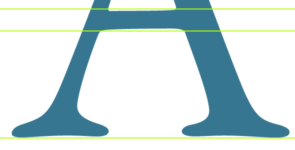
Notice the slightly askew crossbar, and the non-geometrically curved serifs. These hand-drawn features — while not entirely noticeable at small scales — add warmth to the font, and make it more interesting than it would be if it were crafted with absolute precision.
Sometimes a Star Isn’t Just a Star
Below are two illustrations I whipped up for discussion’s sake.
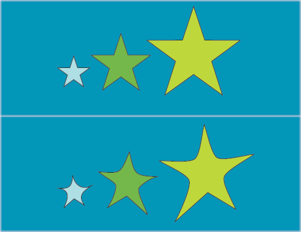
The top one is a collection of stars drawn in Adobe Illustrator using its convenient (and perfect) star tool. It took me all of ten seconds to do. The bottom illustration is the top one tweaked by hand to give the individual stars some, well, individuality. It involved rotating the original stars, then twisting the frames of those stars, and then pushing and pulling on them in order to create some randomness. It took several minutes to do. There’s a place for each of these different illustrations, but you’ll probably agree that the bottom one has a little more, for lack of a better word, life to it. Still, you might be left a little cold by the bottom illustration as well, and that’s because the life given to it was given to it post hoc — there’s only so much you can do to a perfect object to make it imperfect. If I drew these three stars by hand, they would probably look more lively still — the imperfections in them would be inherent, not imposed.
Photography Versus Photorealism
You can see this phenomenon of imposed imperfection at play in the realm of computer animation. Though the field has made incredible strides over the last several decades, no matter how amazing the technology gets, there’s often something missing in the final product. You can always tell when you’re looking at a computer animation, even when it has been edited by masters of the art.
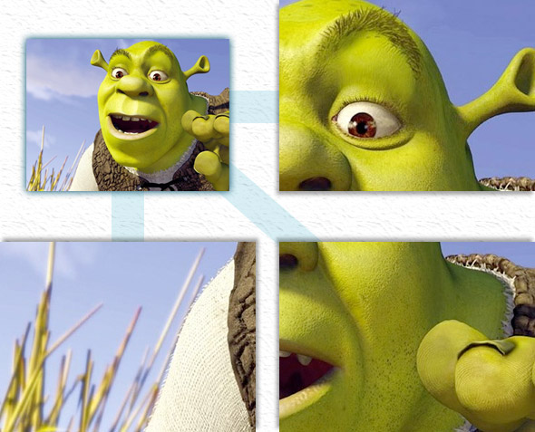
At first analysis, this image seems as if it should be incredibly realistic (ignoring for the moment that it is meant to be a cartoonish character). Imperfections have been painstakingly added here. The hairs in the eyebrows are all different lengths and branch out at varied angles. The eyeball is complexly shaded and shows complicated reflections in it as well. The face is rife with differently sized pores and irregularly spaced whiskers. The fingers have interesting and irregular fingerprints; the fingernail is oddly shaped. The sweater is textured in a close-to-realistic fashion (holes in between the fibers at seemingly random intervals). The grass in the background is out of focus, has complicated shadows, and the blades sit at differing angles from each other.
So why can we still tell that this is a computer animation, not a photograph?
Well, for one thing, it’s the fact that all of this was so painstakingly done that gives it away. A photo of a human face shows a myriad of imperfections without any effort — my face is naturally oddly shaded, filled with irregular pores and whiskers, and complete with unruly eyebrows. Shrek’s face started off as a nice, neat computer drawing with no imperfections whatsoever; and then the imperfections were added one by one on top of it.
Andrew Price has an interesting take on why computer rendering with photorealism as the goal is so difficult. Here are just some of the elements of a real photograph that have to be artificially added onto a 3-D computer rendering: chromatic aberration, vignetting, soft glare, light rays, reflecting glare, bloom, lens flare, glare burnout, ghost glare, depth of field, motion blur, lens distortion, lens dust, scratches, sweat, fingerprints, film developing artifacts, and color grading. It’s a very tall order to formalize all of these properties and give them a natural application via a computer.
Hand Drawing Versus Computer Illustration
Imposing imperfection is also at play in the realm of computer illustration. Engineers have been busy over the years coming up with algorithms to generate smooth curves that aren’t too smooth. Realistic textures have been corralled into service in computer graphics programs in order to make computer illustrations more realistic. So-called “grunge” fonts have come out in force over the last decade, allowing an easy addition of pre-programmed imperfection into one’s designs.
But while all of these strides are important and useful, they can’t take a bit of computer-generated perfection and impose enough imperfection on top of it to easily turn things natural. Here’s a famous frame from an original Bugs Bunny cartoon:
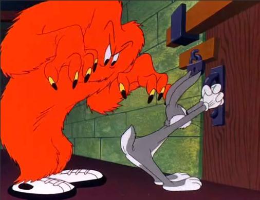
Nothing tricky: simple lines and solid color fills, and yet you can tell in an instant that it’s hand-drawn. I could contrast it here with a plethora of computer-generated Bugs Bunny versions out there on the web, but there’s no need to pick on someone’s artwork in order to make my point. When we as artists get too comfortable with our computers’ tools as a means of adding humanizing imperfections to our work, we are limiting ourselves, and in the end not really fooling anyone.
Being Human
Computers allow one to create photorealistic-like artwork as well as hand-drawing-like artwork. However, neither genre is really the forte of computer graphics — the adding of realistic imperfections isn’t just a matter of clicking on a tool in Photoshop, or running a filter or applying a gradient. It is a serious job, and one that is best handled by artists who have an eye for that sort of thing.
Just as sometimes computers are the right tool for the job (if handled by an expert), sometimes computers aren’t the right tool at all. As designers, we should be sure to have our pads and pens nearby, and remember that we don’t have to rely simply on computerized tools. Sometimes the best way to humanize a design is to have a human design it.