Getting Outside of Your Comfort Zone as a Designer
As a designer (and I’m pretty sure this applies in all fields — I could write a similar treatise about being a musician), there are certain techniques and approaches that will come naturally to you, and certain genres and styles with which you will become intimately familiar and comfortable. Other techniques, approaches, genres, and styles will be harder for you to master, and you may shy away from them once you have gotten into your design comfort zone.
On the one hand, there’s something good about this — you may get really excellent at what you do, and like streams following their natural paths, your skills may coalesce to become a mighty river of excellence. On the other hand, you’re likely from time to time to fall into design ruts from which it is difficult to emerge. For this reason, it’s important for us designers to look outside of ourselves for design inspiration from time to time — seeing what others have done (where other mighty rivers are flowing) can move our imaginations in directions they wouldn’t ordinarily go. And, if we are brave enough to try some things that we wouldn’t ordinarily try, we might get lucky and develop new avenues of excellence.
Typographic Inspiration
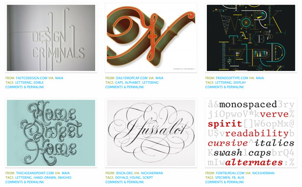
One of my main design interests is typography. I’m amazed at the incredible variety of beautiful work that can stem from just a few dozen letters. And for regular infusions of typographic inspiration from other minds I turn to the following showcase sites:
Here’s a screenshot from WLT:
Note the easy-to-browse, gallery-like setup. All of the above sites are similarly organized, and they all are completely and expertly moderated to cull only the best of the best that’s out there, so your browsing experience is immediately and deeply rewarding. Of course, if you want to brave a wilder and less moderated experience, get thee to Flickr, where plenty of typographic mayhem (often quite wonderful) resides.
Going Retro for Inspiration
One way I’ve gotten tons of design inspiration over the last couple of years is by seeking out so-called “retro” designs. Looking to the past shows you font use and color palettes you don’t see in everyday contemporary life. Check out these links to thousands of scans of vintage paperback book covers, and get ready to spend a long time browsing through the fascinating variety therein:
- http://www.flickr.com/groups/vintagepaperback/
- http://www.flickr.com/groups/paperbacks/
- http://www.bookscans.com/
- http://luridwasbeautiful.blogspot.com/
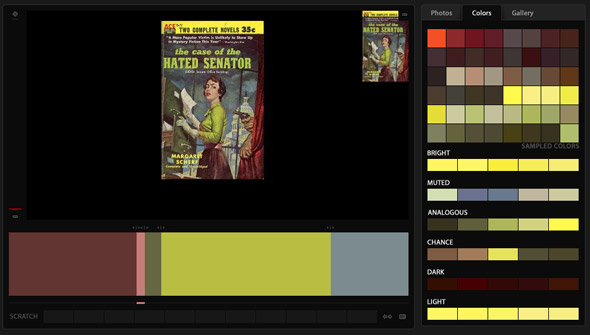
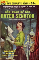
Many covers from the era reproduced actual paintings on them, and so the color palettes are generally very well thought-out and lovely. And, if you’re not a painter, you might not think to develop similar palettes in your own work. Take the cover shown here from 1954, featuring a painting by Rafael DeSoto.
One possible color palette of five colors taken from the painting is represented beneath the cover in the screenshot below:

Given the way my brain is wired, there’s no way I would have come up with this palette on my own. Dark, grimy pink and dull greens? But it really works, and could be applied to a (say) web design with very interesting and perhaps lovely results.
Other Vintage Inspirations
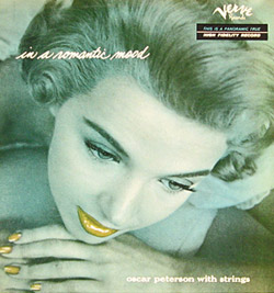
There are a lot of other areas to plumb for design inspiration. I like to browse through vintage album covers as well (jazz album covers are a particular weakness of mine):
- http://www.flickr.com/groups/52240935629@N01/
- http://www.flickr.com/groups/favouriterecords/
- http://www.birkajazz.com/archive/columbia.htm
- http://lpcoverlover.com/
And vintage signs offer some interesting typographic and color choices as well:
- http://www.flickr.com/groups/ilovesigns/
- http://www.flickr.com/groups/41655158@N00/
- http://www.waterwinterwonderland.com/vintagesigns.aspx
Designers: don’t get bogged down in your comfort zones! Get out there and see what other people are doing, and what people have done before you.


You should also check out photographer John Purlia’s collection of vintage album covers (mostly from 50’s and 60’s) on flickr. Bombshells and cool retro fonts galore.
http://www.flickr.com/photos/johnpurlia/sets/
Nice! Thanks for the link!