One of my favorite parts of my job is the intersection of the written words and artistic design/visuals. Since strategizing, defining, and writing are my usual “duties” and involve filling the “blank” page with prose, it is always a thrill to see how transformed a document becomes when given time and attention from a graphic designer.
Since so much of our economy and business activities are now conducted online, I thought I would list my top five websites – strictly from a visual perspective. Personally, I have more freedom than I do professionally. I am not a stickler for “best practices” or “user-friendly” navigation and architecture. I just like the looks of things. The colors, the position, “the look and feel” draw on my emotions. And just looking at these sites makes me happy:
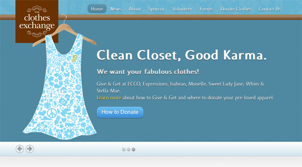
Vermont Clothes Exchange
I like this site because it is branded so well, and the print on the dress is just fabulous. So is the color. Love brown and the turquoise-y blue together.
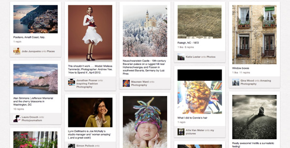
I don’t know how Pinterest does it, really. All these “pins” showing so many various things from all over the place – and yet, every page looks clean and inviting, from the Home page to my very own board. I’m drawn in.
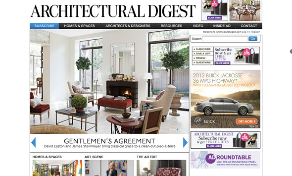
Architectural Digest
Truth be told, I’ve never seen any site from architects that isn’t beautiful. I think it’s the photography. There’s never a lousy photo on any site dealing with architecture.
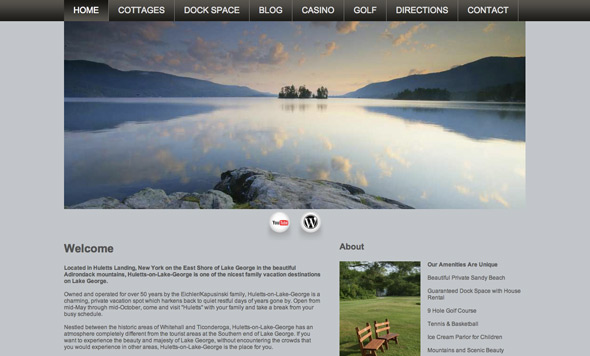
Hullets on Lake George
Love this home page because, well, this is my favorite place on earth. Seriously, Lake George does not take a bad picture. And this website is all about my little slice of heaven, so I had to include it.
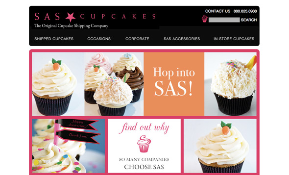
SAS Cupcakes
If by chance you ever pass through Newark, Delaware, then do yourself a favor and visit Sweet and Sassy Cupcakes on Main St. This bake shop looks and feels just like this gorgeous website – and the cupcakes are terrific.
So – for all of you graphic artists out there – I salute you! Are there scientific, layout-y regulations and specific reasons for why I find these sites so visually appealing? Or is it just that I love clothes, lakes, cupcakes, and stunning homes? (What girl doesn’t?) I’d love to hear from you – and visit your fav websites.



Website Favs from a Non-Designer | Change Conversations http://t.co/COvXRAiY