
As a designer, how do I tell you, as a client, why a certain typeface works well for your ad? How do I explain the allure of a particular color—why it will resonate with your audience, or why all other colors and design elements work with the design and properly communicate the feel of your brand, the advertising message, company philosophy and mission? How do we effectively explain what is a relatively complex process of bringing a product to market or launching a campaign? And how can I help you understand my intuition about why a particular design approach will be effective? Intuition, what renowned graphic designer David Carson calls “not the only ingredient in design, but possibly the most important”
Translating the language of design
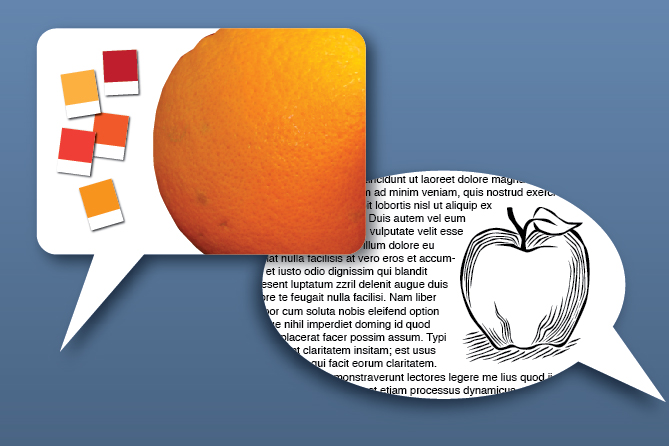
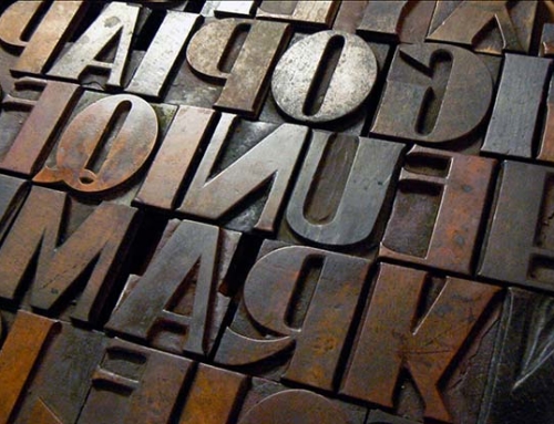
More than once I have found myself in the middle of talking with a client and realized I needed to back up a bit and translate what I had been saying into plain English. As designers and marketers we have our own special language— we talk about about proportion, look and feel, contrast, scale, emphasis; discuss eye path, call to action, demographics, branding, logo and identity; explore color palette, shade, hue, chroma; specify PMS, LAB, HEX, CMYK, RGB; pore over ascenders, descenders, ligatures, kerning and letterspacing; research font, face, point size, weight, foundry; choose san serif or serif, justified or flush left/ragged right; utilize semiotics, geometry, composition, texture; employ harmony, sequence, rhythm, pattern and balance; pay attention to accent, dominance, symmetry, discord, and tension. Pontificating on a select few of these terms to explain or justify a design decision, without regard to a client’s knowledge or interest, can confuse and overwhelm, or communicate lack of interest, ignorance and arrogance. Not a good way to build relationships and create a partnership with you in the marketing process.
Designer as communicator, educator, diplomat, psychologist
As professional communicators, we must use our skills not only in forging effective creative work, but also when working closely with you on your project. This involves both making the effort to translate our language into terms and ideas that will be understood, as well as educating about the specifics for this project, the processes involved, and the minutiae that affect time, cost, and outcome. There is a point when I have to stop explaining, understanding either that you may have reached a saturation point for details, or, worse, that I have gone beyond what is a necessary or appropriate level of information needed for either you as client or me as designer to successfully move forward.
In other words, there is a certain level of detail that is neither important or interesting to anyone except the designer. Knowing where that point is demands a comprehensive grasp on efficient time and project management, and knowing you as a client—your level of desire to be involved in the process, your attention span, your position in the organization, and your skill set(s). You may be an experienced marketing director whose job is to understand this language, who has patience and wants to be hands-on. Or, you may be a business owner with little experience in marketing or design who wants specialized professionals to handle all aspects of creative. It is the designer’s responsibility to consider these factors, use his or her people skills, and adjust the dialogue accordingly.
Expanding your horizons, understanding your biases
Many of us have biases that we need to overcome if we are to create effective work. We do this by constantly building and improving our knowledge of what works. For example, let’s say I hate blue (actually I don’t hate blue), and not only do I hate blue, but I hate the very shade, strength and hue of blue that would really make a design work perfectly for you and your customer demographic. I need to put aside my bias in favor of what is correct and appropriate for the job. I have to ask myself, what does a project require? Coming to a project with a closed mind or limited experience as a designer serves no one. Being a better designer involves absorbing as many influences as possible and synthesizing a solution that works, based on all the factors involved, not just my preference for san serif type and stainless steel.
Clients have preferences and biases as well. Let’s say for example, that a client wants to use all caps, san serif type for a lengthy piece of body copy. I would explain that research has shown that ALL CAPS SAN SERIF TYPE HAS BEEN PROVEN HARDER TO READ than Upper & Lower Case serif type. Especially if it’s justified (left and right sides of the text block are a straight line). With long line lengths (over 2-1/2 alphabets long), thin characters, reversed (colored white) out of a light background. This kind of brief explanation can be educational and help a client quickly see the practical reason for making a legible type formatting choice.
A win for the joint team
It’s the biases toward other, arguably more subjective and intuitive stuff like color, and look and feel, that can be more of a challenge to overcome. I ask you, as a client, to explain why you like or dislike a design element or believe something needs to be changed to achieve the project’s objectives. It is my responsibility to use my design experience and communication skills to help present you with a compelling, intuitively sound, research-based reason for a design solution you may not at first favor. As a designer, I need to be able to justify our team choices in a positive, educational and results-oriented way so that you, as the client, can address biases (if any), expand your knowledge (if needed) and enjoy working with our joint team to achieve marketing success.

