
You’d think I would have learned this lesson. Last year I set out criteria for evaluating quality and lamented the overall lack of sustainability infographics. This year I can report sustainability visuals are abundant, thanks in large part to the meteoric rise in popularity of the social network Pinterest. But I’m not at all sure visual learning about sustainability is any further ahead.
Quantity Not Quality
Many people have documented the rise of infographics in recent years. Yet what increased numbers can’t tell you is whether you’re likely to gain new insights from the plethora of bright colors. Given the difficulty I had finding even a few to recommend from among the torrent, I’d say communicators interested in advancing understanding of sustainability will continue to enjoy a major opportunity to meet the sustainability audience’s content needs.
Sustainability Broadly Speaking
The problem is not due to a narrow definition. I use the United Nations Education for Sustainability standards, which include as sustainable the overlap of social, environmental and economic factors.  But broadening the scope beyond green just offers more chances to encounter junk. Many of the so-called health data visualizations offer little data and are simply disguised advertisements for various companies. Some of the attractive environmental images on Pinterest lead you to spam or coupon shopping websites. And as for the economics of sustainability, well, when do you remember seeing anything more attractive than a simple plot graph?
What do you think? If there’s a quality sustainability infographic you think should be added to my list below, or if you’re planning to develop one for your organization and would like to be included next time, please let me know in the comments.
The Top 5 Sustainability Infographics of 2013 (so far)
1.
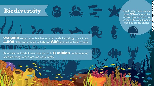
CNN’s multi-media examination of threats to the Great Barrier Reef includes two colorful visuals: reasons reefs are important (at top) and a summary of key facts and figures. The selective use of high-impact facts and the vivid colors make both of these work.

2.
Fracking: How It Works. Although there’s a lot going on in this diagram, the process itself is complex so detail is needed to honor the promise of the headline.

3.
Next up is Enterprise Sustainability Trends in 2013, an example of a commercial infographic that works. The path metaphor is a useful (and attractive) way to quickly highlight ten trends. Ideally sources and data to support the trends will be included in the future, but Infosys took an important first step in looking at corporate sustainability efforts.

4.
The Union of Concerned Scientists is hosting an interactive infographic, The Healthy Farm: A Vision for U.S. Agriculture, on visual.ly, the leading infographic social network. I selected this one because there is so little available visually on this key subject and the practices and benefits are clearly shown at the bottom below the fold with links to additional information. I must confess though that it feels dated to have to ‘interact’ by clicking on the + signs to get information on a static image. I was surprised when a mouse-over or some form of animation didn’t engage me.

5.
Let’s finish our tour with Sustainable Energy for All – What Will It Take? The sectioned image clearly lays out the World Bank’s action plan, three goals and suggested tactics — with supporting facts and data. This is an infographic that offers value even with a quick scan, plus more value if you have time to explore and follow up.

Whole week of Facebook material 🙂 RT @pheffernanvt: The Top 5 #Sustainability Infographics of 2013 (so far) http://t.co/4Ln5tM4wtz
[…] See on http://www.marketing-partners.com/conversate […]