
I thought the explosion of infographics and visuals on sharing networks would mean I’d have no problem finding 6 good ones on the subject of sustainability, but this turned out not to be the case. Ideas to make the world a better place can be powerful — and complex. It seems social math examples, process visuals and well-designed infographics can be powerful tools to help your cause only if you avoid what Edward Tufte termed ‘chartjunk,’ which includes the seduction of pure visual appeal without accurately conveying information.
Expectations Set by Edward Tufte
An infographic is simply a chart or diagram that clearly and beautifully displays quantitative information that would take pages of text to explain in words. Some things to look for in a good infographic include quick clarity (the presenting of data in not only a lucid but also an immediately digestible manner), creative quantitative display (using something besides standard bar graphs and pie charts to display your data), and overall beauty of design. If you have not yet discovered Dr. Edward Tufte, my recommendation is to check out his first (and to me his best) book, The Visual Display of Quantitative Information, from any public library.
My Personal Knock-Out Factors
In addition to Tufte’s general guidelines, I have a few pet peeves of my own that I believe to be the result of over-exposure to the relatively recent surge in the volume of infographics and ‘pinnable’ visuals. I eliminated candidates based on the following criteria:
- Not available as a large enough image to read the text
- Company logo too large or at the top
- No sources shown
- Overwhelmingly black with too much detail or insufficient contrast
- Way too long vertically to fit on screen or to print (some are absurd!)
My knock-out factors are only useful because I suspect I am not alone, so you may want to keep that in mind if one of your objectives is to encourage sharing of your infographic.
The Top 6 Sustainability Infographics
1.
Blueprint for A Sustainable Brand represents key findings from Euro RSCG Worldwide’s Consumer Conscience study, based on an online survey of 4,000 adults in Brazil, China, France, India, the United Kingdom, and the United States.
 2.
2.
This simple diagram showing the dramatic rise in Genetically Modified Organisms (GMOs) used in our food, is the only example with a black background that I selected. Its simplicity, use of color and high contrast make it work.

3.
Here’s another example on the subject of GMOs, this time the data represent the key findings from an advocacy group. The headline is clearly and strongly supported by the diagram and the data.

4.
Next up is an example on the subject of the true cost of energy when energy subsidies are considered. Given Congress’s ongoing delay in renewing incentives for renewable energy production, I sure wish this data was more widely understood!
_EnergySubsidies")
5.
IBM’s Smarter Planet campaign often includes clear, simple diagrams and infographics to communicate facts to support its messages. Although a bit too vertical for my tastes, here’s one on the need for water management systems.

6.
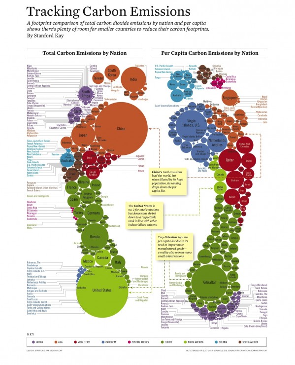
And let’s finish our tour with an example of a ‘corrective’ infographic on the carbon footprint of various countries around the world. You may have seen the original version, which although visually stunning had tiny text against a black background and left the impression that China and the U.S. were the only major problems. In contrast, the follow-on version is against a white background to improve legibility — and adds a second footprint to show the data adjusted for population on a per capita basis.

The Top 6 Sustainability Infographics of 2012 (so far) | Change Conversations http://t.co/F32sAzri
The Top 6 Sustainability Infographics of 2012 (so far) | Change Conversations http://t.co/5VQocOpn
The Top 6 Sustainability Infographics of 2012 (so far) | Change Conversations http://t.co/4cZTRZjV RT @SybilMcLain << Thanks
RT @cmehallow: Top 6 #Sustainability Infographics of 2012 (so far) | Change Conversations http://t.co/T3B7vWqV @GRI_Secretariat #CSR…