The trend is not good. In 2012 I set out criteria for evaluating quality infographics, lamented the overall lack of sustainability infographics to educate and inspire, but found 6 worth highlighting for you. Last year I found 5 infographics worth highlighting and reported although there was an abundance of sustainability visuals thanks to the rise in popularity of social network Pinterest, that the increase in quantity was not matched in quality. Things look even worse this year — so far there are only 4 candidates worthy of mention. 
Criteria for Selection
In addition to Edward Tufte’s general guidelines for the visual display of information, I have a few pet peeves of my own that have only solidified after over-exposure to the surge of infographics and ‘pinnable’ visuals. I eliminate candidates based on the following criteria:
- Not available as a large enough image to read the text
- Company logo too large or at the top
- No sources shown
- Overwhelmingly black with too much detail or insufficient contrast
- Way too long vertically to fit on screen or to print (some are absurd!)
My knock-out factors are useful because I know I am not alone, so you may want to keep that in mind if one of your communication objectives is to encourage sharing of your infographic.
The Top 4 Sustainability Infographics of 2014 (so far)
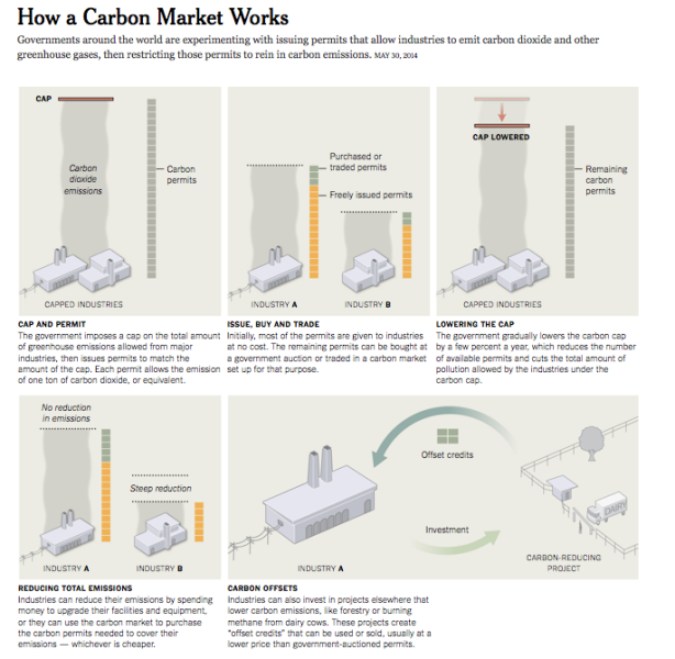
1. Top billing goes to the New York Times for its graphic explaining how a carbon market works. Given the dearth of decent infographics from other sources, the success of data journalism is an encouraging development. Now if we can only get more interest going to focus on sustainability as least as often as politics and sports….
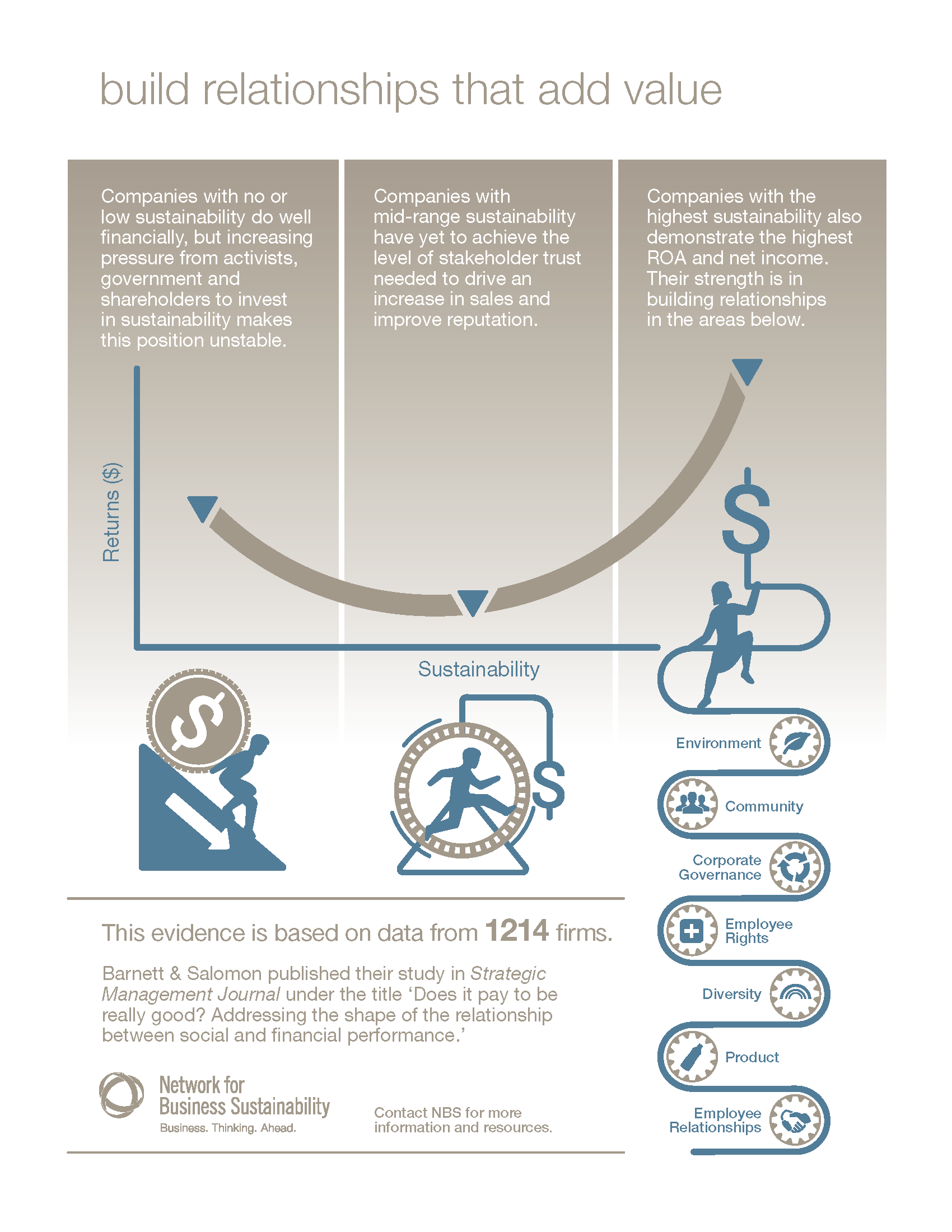
2. The ROI of Sustainability and Relationships is a one-page visual summary of data created by the Network for Business Sustainability from research published in the Strategic Management Journal.
 3. Next up is global logistics from UPS, as an example of a commercial infographic that works. As an understated one-pager, this continues to be a model for corporate sustainability efforts.

4. Not surprisingly, GMOs are the subject of many infographics these days. Unlike any of the examples in 7 GMO Infographics You May Have Missed, however, this uncluttered comparison-style visual meets the criteria for informational communication.

What do you think? Is it time to call on friends and colleagues in the community of nonprofits and businesses whose mission is ground in sustainability? If you’ve seen a recent sustainability infographic you think educates and inspires us to earn a place on the list, or if you’re planning to develop one for your organization and would like to be included, please let me know in the comments.