
A brief overview of the definition of logo, identity and brand, and an exploration of these terms, which are often used interchangeably but have important differences in meaning.
Logo, Corporate Identity or Brand—What’s the Difference?
![]()
Logo, Corporate Identity or Brand — What’s the difference? When a company begins to consider ways to visually represent themselves, their product, service or idea, these terms are sometimes used interchangeably. There are significant differences though, and building a solid understanding of these three terms is valuable for every marketer.
Building and Maintaining Your Corporate Identity

I started this series with the post Logo, Corporate Identity or Brand — What’s the Difference?, which briefly defines these terms and what differentiates them. Since I often hear the terms used interchangeably, (and have even done so myself), it seems important to dive more deeply into distinguishing logo, identity and brand from each other and explain why they are not synonymous. In previous posts in this series, we explore logo design.
There are three basic types of logos—three ways to tell the story of a brand: the symbol, an iconic standalone image; the wordmark, which uses distinctive typography; and the combination logo, which uses both image and type.
Logo Design 101: The Symbol
![]()
According to the omniscient Wikipedia, a logo is “a graphic mark or emblem commonly used by commercial enterprises, organizations or even individuals to aid and promote instant public recognition”. A logo’s job is to quickly and succinctly identify, symbolize, introduce, and tell the story of a company, service, product, individual or idea. There are many synonyms, each with unique definitions and characteristics that can inspire or inform the design direction for a logo: graphic; ideogram; emblem; totem; ensign; hallmark; icon; avatar; symbol; badge; colophon; insignia; monogram; trademark; pictograph; stamp; mark; logogram; crest; and, of course, brand.
Logo Design 101: The Wordmark
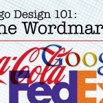
Whether comprised of initials (IBM=International Business Machines; RCA=Radio Corporation of America) single words or multiple words, wordmarks generally stand on their own with no accompanying symbol. Their distinct character is due in part to the typeface chosen. Typefaces, or fonts, have unique characteristics that can be used to communicate a look and feel, make a desired impression on a desired demographic. The variations are virtually limitless.
The combination logo is arguably the most common logo design approach. This ongoing series continues to explore different categories of combination logos and strategies of design and image choices
Logo Design 101: The Combination Logo, Part 1: Initials
![]()
In this fourth article in the series, Logo, Corporate Identity or Brand—What’s the Difference? we start to explore the third category of logo design, the combination logo. Logo Design 101: The Symbol looked at the origin, history, purpose, and meaning of symbols. Logo Design 101: The Wordmark dealt with the importance of font choice, typeface design, color, style and creative interaction of letterforms in creating a distinctive wordmark. Because it contains both a symbol and type, the combination logo design strategy includes much of the content covered in both of these previous two articles, and also addresses the integration of these elements.
Logo Design 101: The Combination Logo, Part 2: Seals
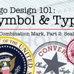
In this fifth article in the series, Logo, Corporate Identity or Brand—What’s the Difference? we continue to explore the third category of logo, the combination mark. In case you have not read the previous articles, Logo Design 101: The Symbol looked at the origin, history, purpose, and meaning of symbols. Logo Design 101: The Wordmark dealt with the importance of font choice, typeface design, color, style and creative interaction of letterforms in creating a distinctive wordmark. The combination logo design strategy, because it contains both a symbol and type, builds on the content covered in both of these previous two articles, and also addresses the integration of these elements.
Logo Design 101: The Combination Logo, Part 3: The Coat of Arms, Crest and Shield
n article 6 of the series, Logo, Corporate Identity or Brand—What’s the Difference? we continue to explore combination marks—logos using both typography and symbols—as we delve into the design categories of crests and shields.
General thoughts and musings on logos
For the Love of Logos

When I was very young I was fascinated by logos. The bursts of color and energy of tiny oil company logos on the backs of my mom’s credit cards, the clever, illustrative Velcro logo and the negative and positive space of the typographic Eaton logo. In 1974′s Miami Dolphins vs. Minnesota Vikings Superbowl, I chose my favorite team based on their logo’s color scheme. It was Miami’s Turquoise and Orange. As a teenager, there were rock band logos–I reproduced the Aerosmith logo perfectly in black marker on my school notebook; network TV ID’s–the 1960′s NBC Peacock, the CBS “eye” or the mid-Seventies abstract NBC “N”? And of course, cars.
Logo Design: Is Boring and Ugly the new awesome?
![]()
The world is full of bad, ugly and boring logos. Everywhere you look, someone has, in their mind, saved a boatload of cash by cobbling together some art done by their cousin or preschooler and the first typeface that struck their eye as they scrolled down the font list in Publisher. Which is usually comic sans. I understand. Not everyone needs to hire a professional designer. Not everyone can afford a comprehensive identity development. Sometimes it makes sense to put your money elsewhere, especially if your customers will never be affected by it.