

On a search for good visuals on early child development the other day, I suddenly realized that sustainability is not the only change marketing issue suffering from a dearth of quality infographics and compelling message images. Oh there are plenty of gratuitous baby photos tugging at heartstrings, but I found few visuals working hard to educate and inform. So in the hope that positive recognition will encourage others to help fill this gap, here are my picks for the top five early childhood infographics and visuals so far this year. (And about the lemur photo at the top of this post? I promise to answer that question too.)

Infographic Expectations Still Set by Edward Tufte
An infographic is simply a chart or diagram that clearly and beautifully displays quantitative information that would take pages of text to explain in words. Some things to look for in a good infographic include clarity (the presenting of data in not only a lucid but also an immediately digestible manner), creative quantitative display (using something besides standard bar graphs and pie charts to display your data), and overall beauty of design. If you have not yet discovered Dr. Edward Tufte, my recommendation is to check out his first (and to me his best) book, The Visual Display of Quantitative Information, from any public library. (Think Dr. Seuss, with numbers added.)
My Personal Knock-Out Factors
In addition to Tufte’s general guidelines, I have a few pet peeves of my own that evolved in response to the uncurated volume of infographics and ‘pinnable’ visuals flooding the Internet and social media networks in recent years. I eliminated candidates for Top Early Childhood Visuals based on the following knockout criteria:
- Not available as a large enough image to read the text
- Company or organization logo too large or at the top
- No data sources listed
- Overwhelmingly black with too much detail or insufficient contrast
- Way too long vertically to fit on any size of screen, or to print (some are absurd!)
My knockout factors are only useful because I suspect I am not alone, so you may want to keep that in mind if one of your objectives as a change marketer is to encourage sharing of your infographic or visual.
Top Five Early Childhood Visuals of 2013 (so far)
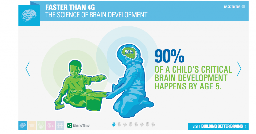
1.
Faster than 4G: The science of brain development is one of many visuals from Arizona’s First Things First. This choice is a series of visuals with key brain science facts, which is designed to be shown sequentially in a horizontal slideshow. I like the clean simplicity of one fact per slide, which cumulatively seems to have a greater impact than if all five slides were stacked vertically into one infographic. What do you think?
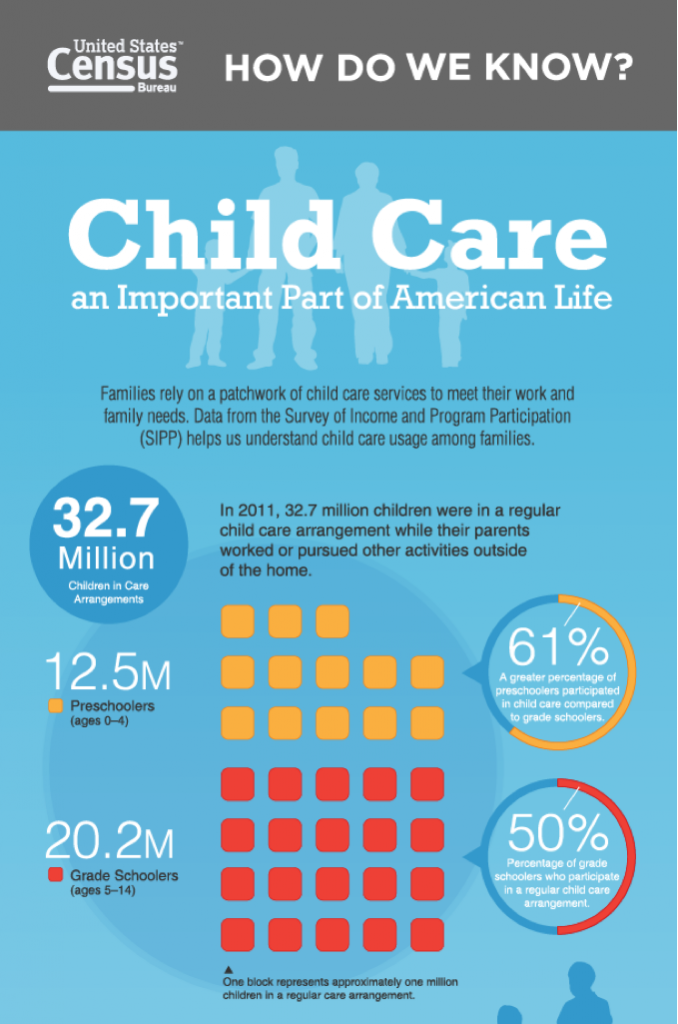
2.
Child Care: An Important Part of America Life, hails from the U.S. Census Bureau. This is not one of those overly designed and cluttered posters found on many government websites. Here an uncluttered display of basic images and key facts quickly paints a picture of the importance of child care in the U.S. The title says it all.
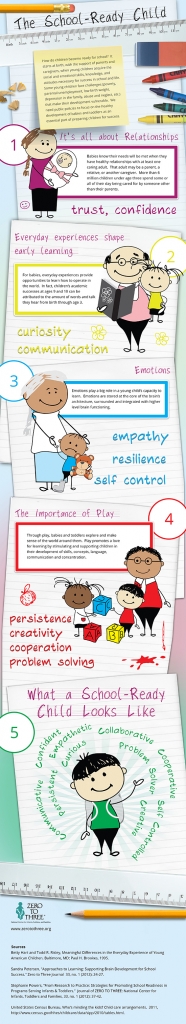
3.
This is Your Child’s Brain on Television is an example of an infographic developed by an organization with clear goals for encouraging sharing and getting its name out. But Online College Courses, a directory of MOOCs The School-Ready Child, from ZERO TO THREE, is less of a data-heavy infographic than it is a poster with multiple messages. This exceeds my preference for vertical length and comes close to being too cluttered for my taste, but multiple messages are communicated in what is essentially a 5-page storybook style that may appeal to many young families. Enough With Baby Talk — Infants Learn From Lemur Screeches, Too, from NPR. I know, I know — this is neither an infographic nor a message poster. It made my list because it’s an example of using a strong image (and sound) to draw attention to important information. Just because your subject is early childhood, there’s no need to feel you are limited to using babies, cartoon stick figures, and crayon colors. On a subject so important, the limited number of early childhood visuals I found working hard surprised me. Please let me know in the comments below if you think I missed a compelling example of an early childhood visuals published this year.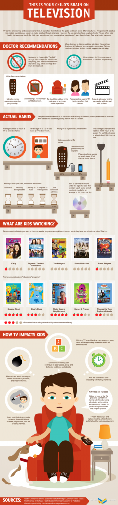
4.
5.


